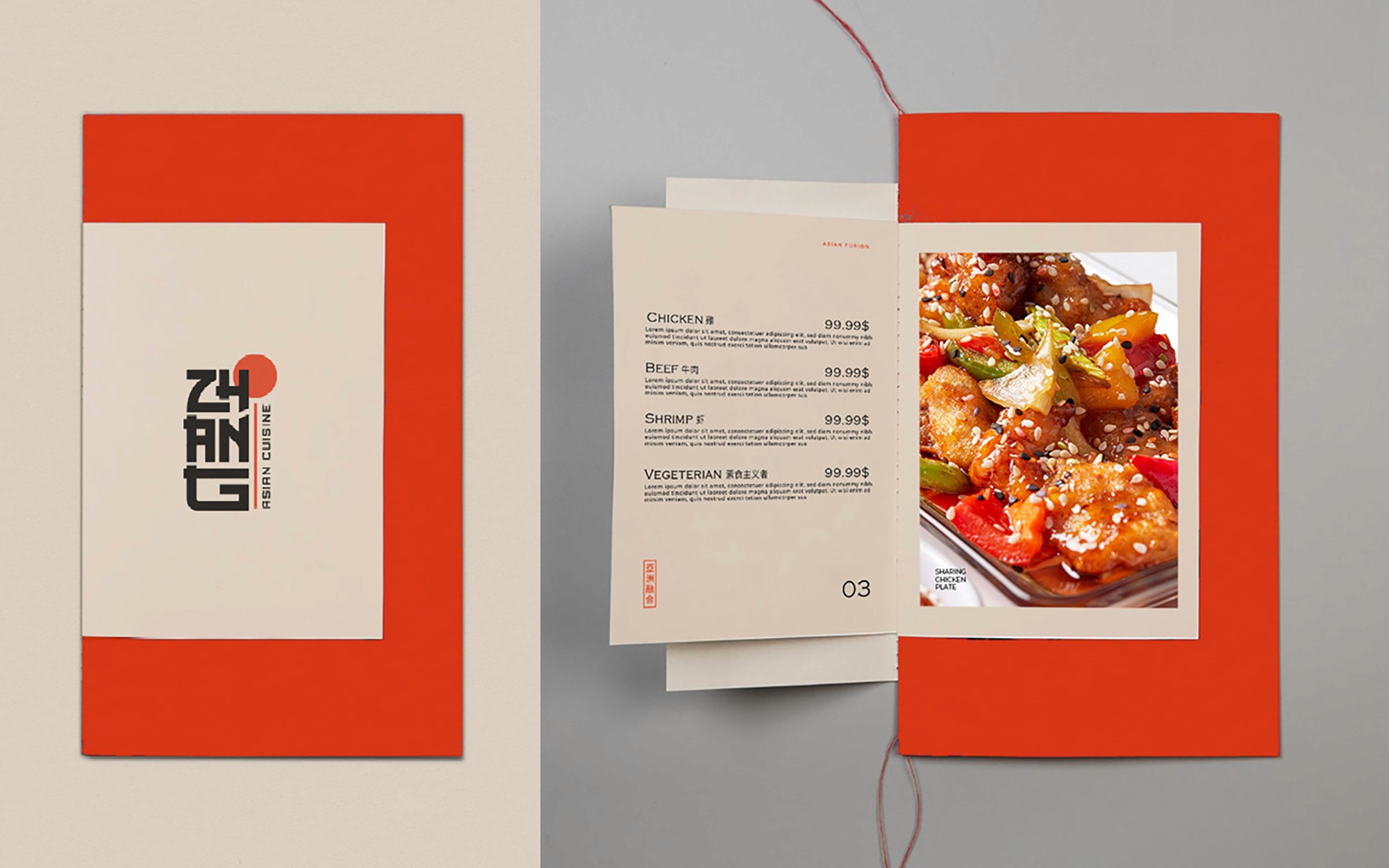
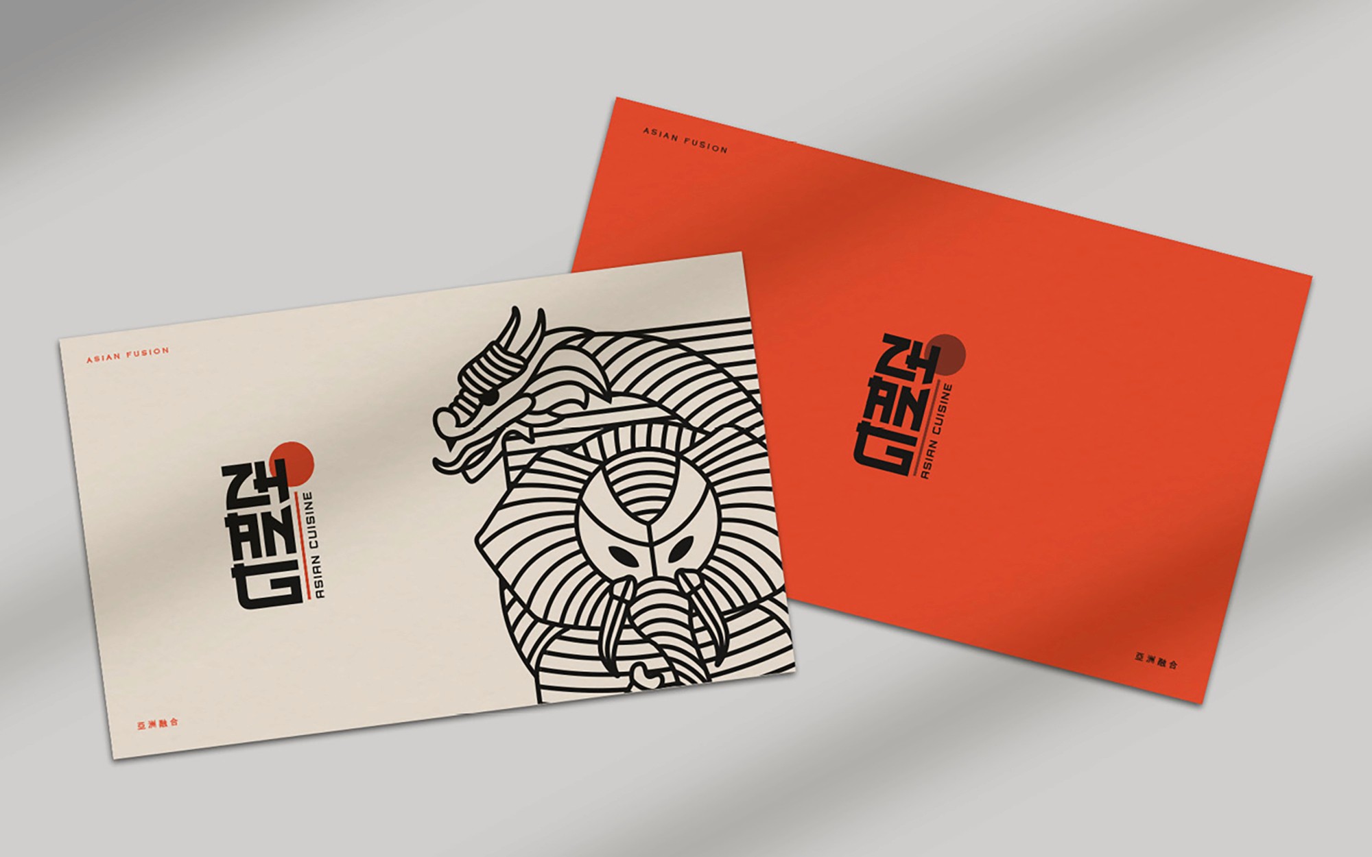
Brand Identity

Client: Zhang Asian Cuisine
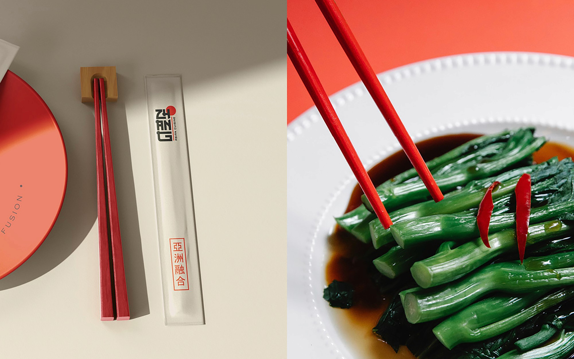
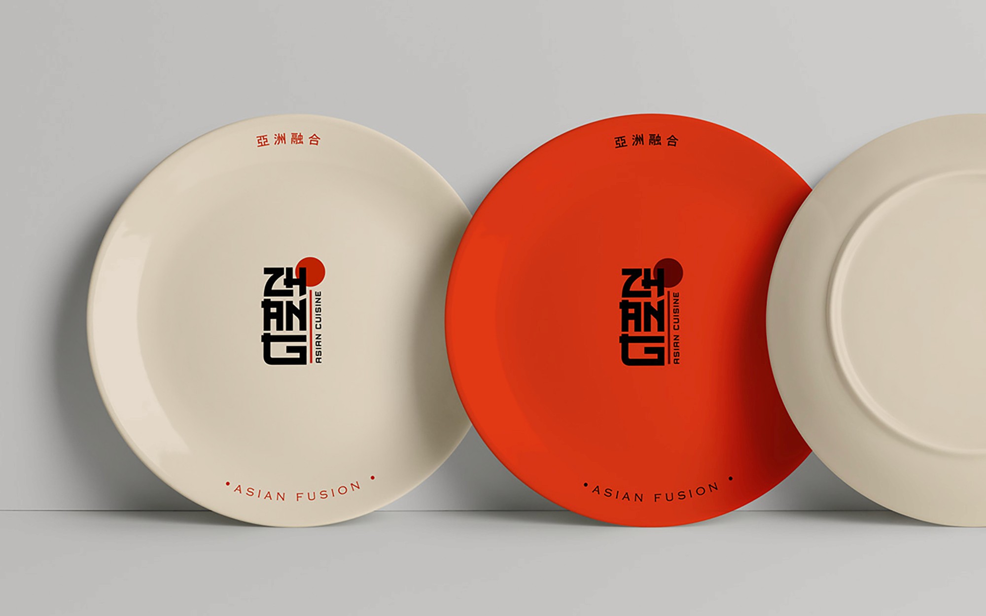
Scope: Brand Identity, Packaging, Collateral, Uniforms.
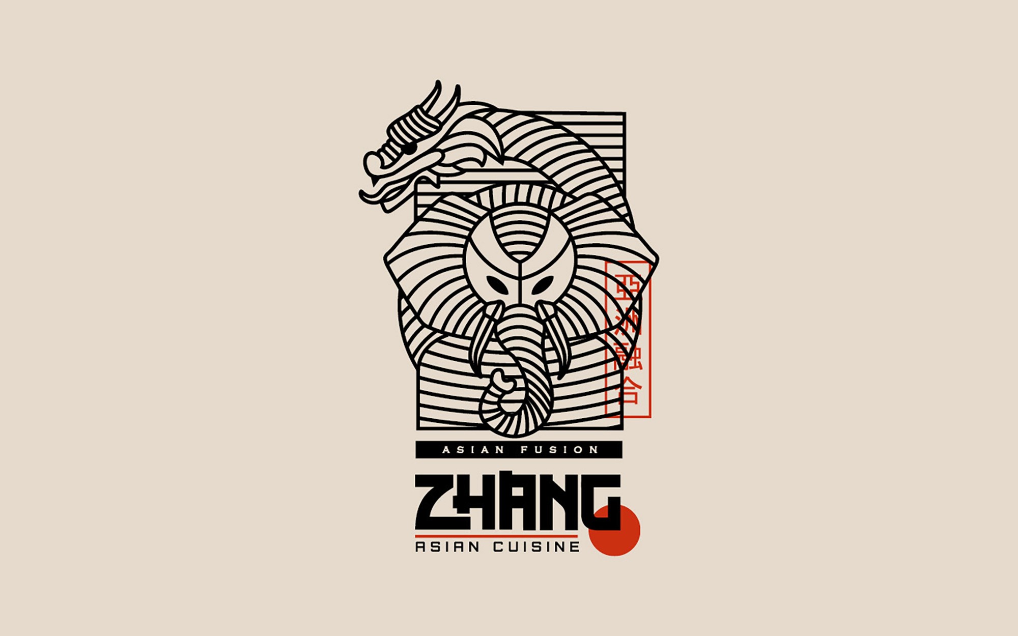
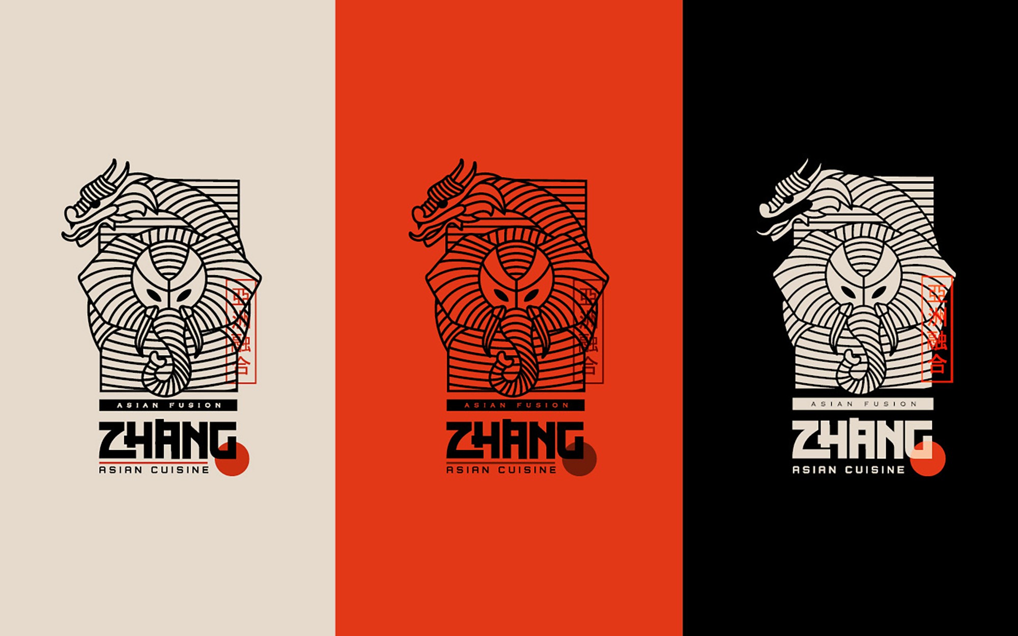
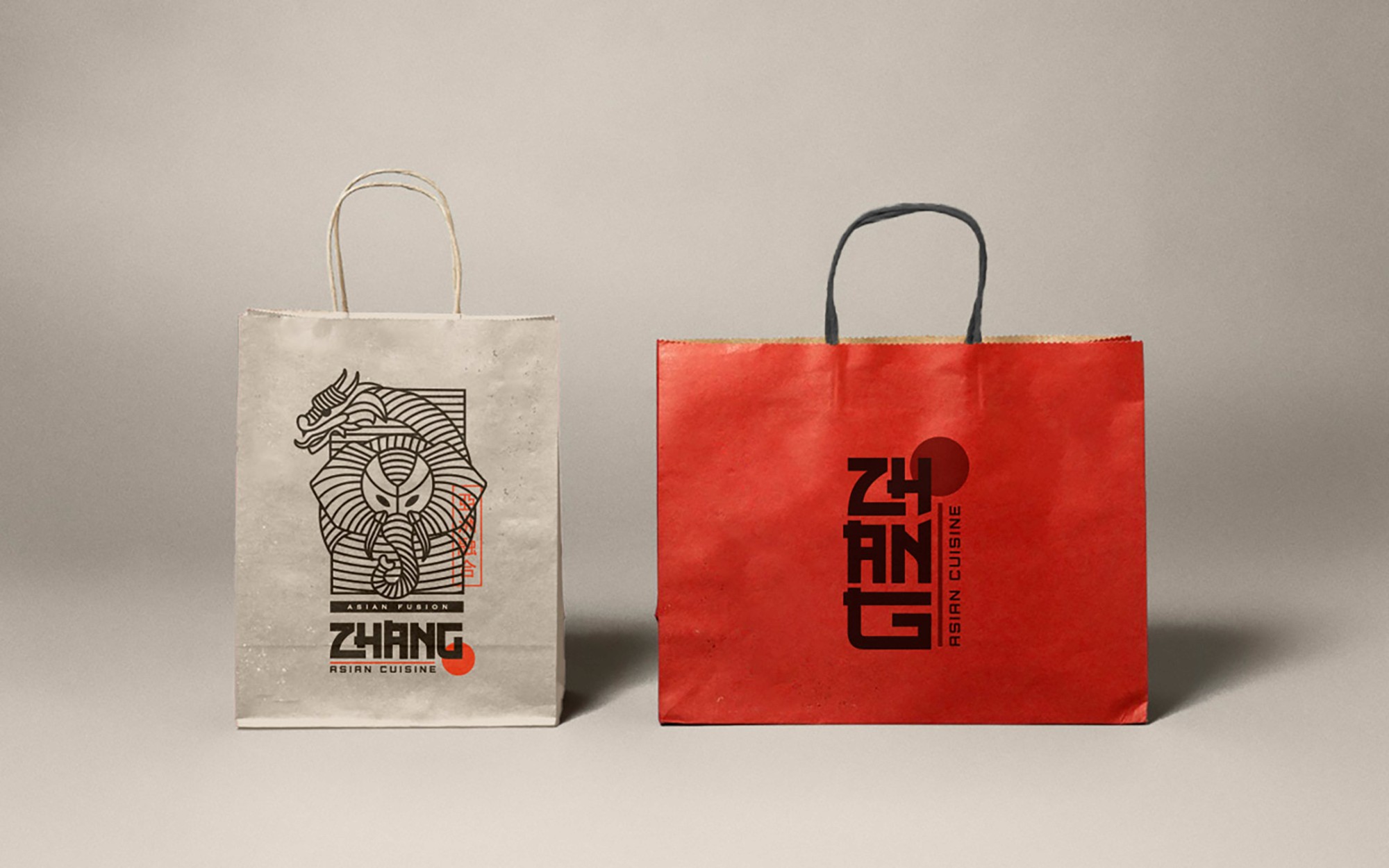
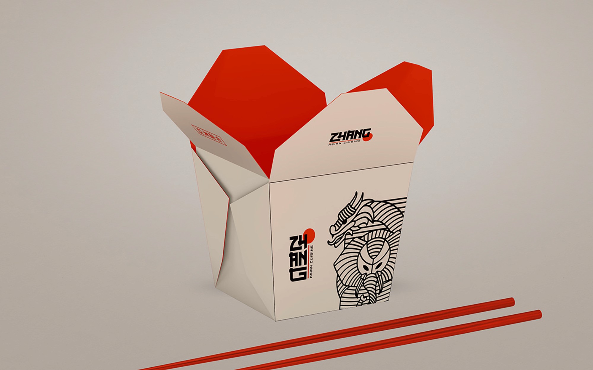
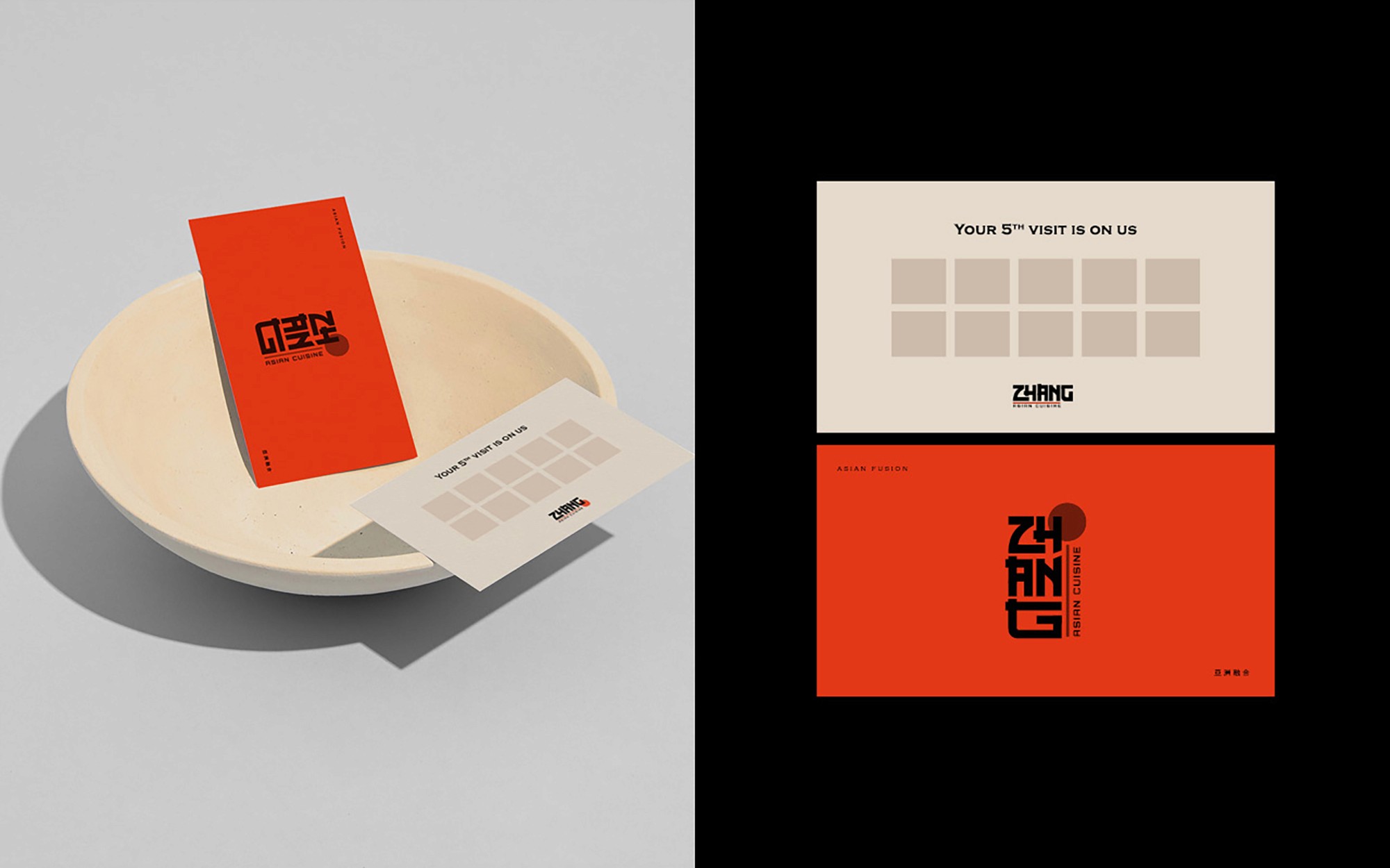
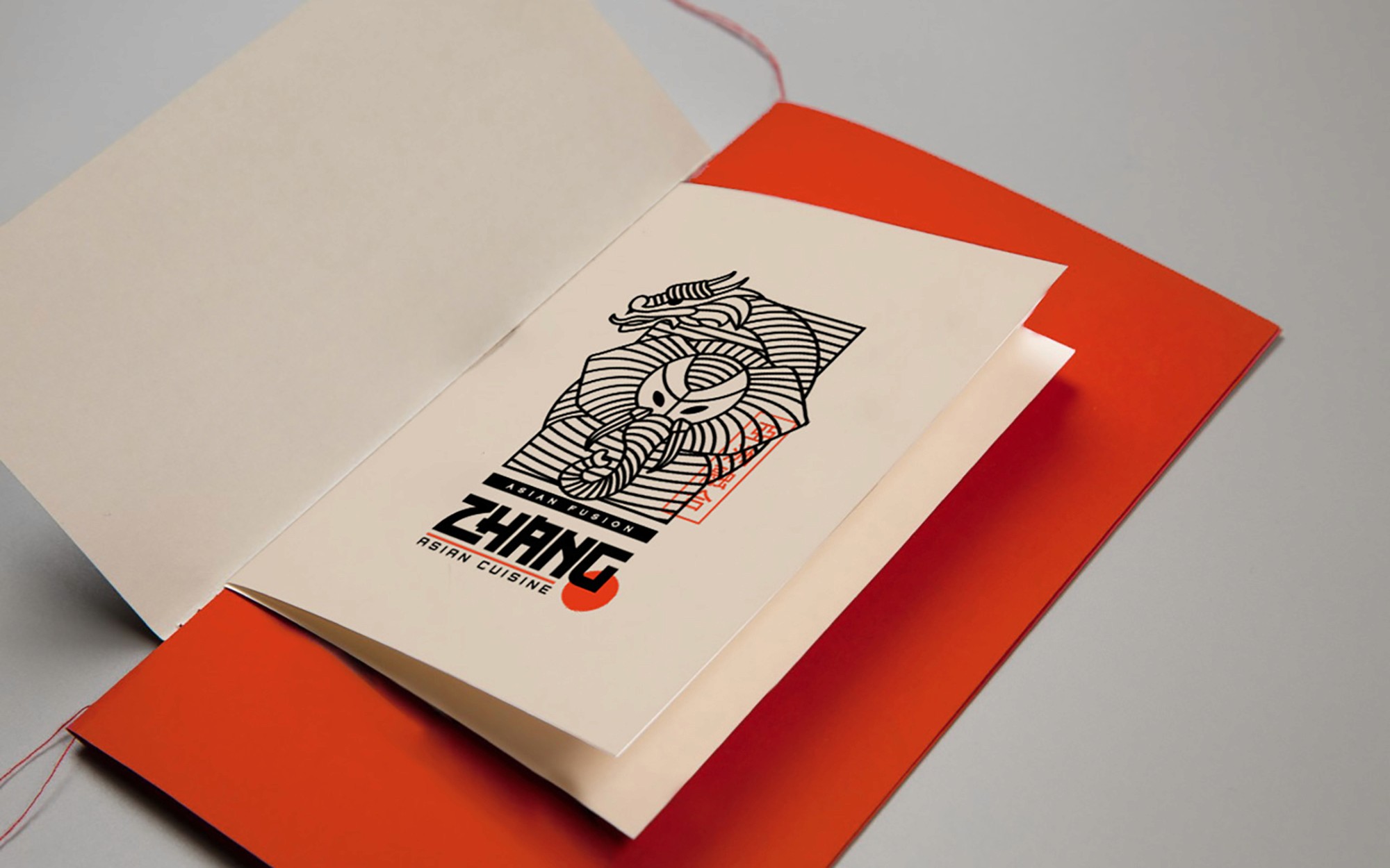
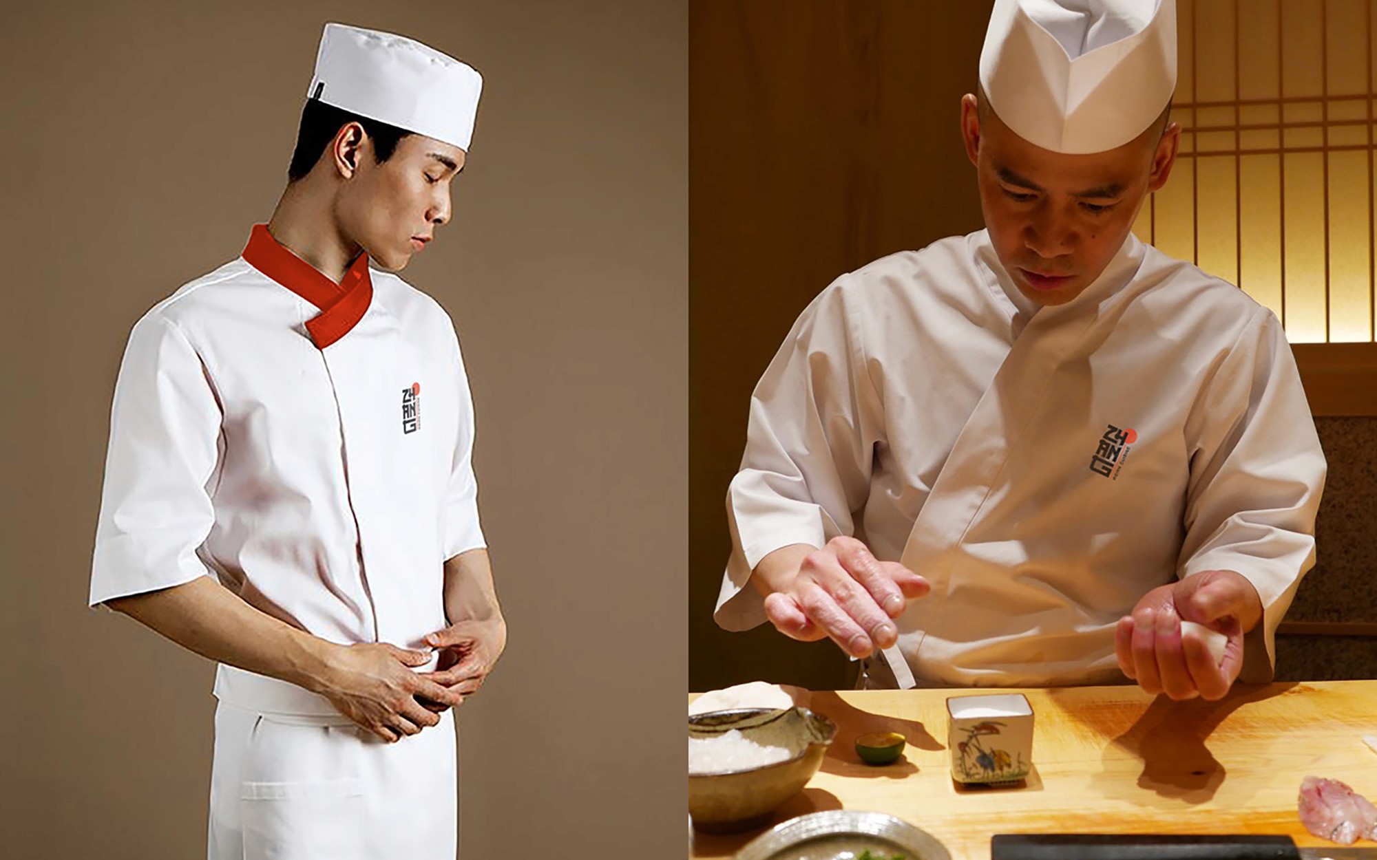
An Asian fusion restaurant that needed an identity with real edge to it. The wordmark stacks the letters vertically, drawing from East Asian typographic structure. The red circle sits as a recurring anchor across every application. Bold without being loud.
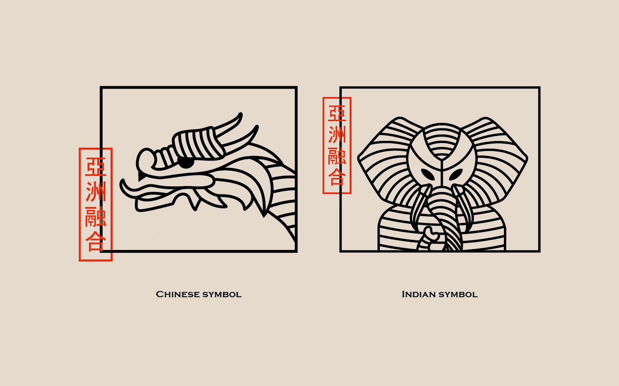
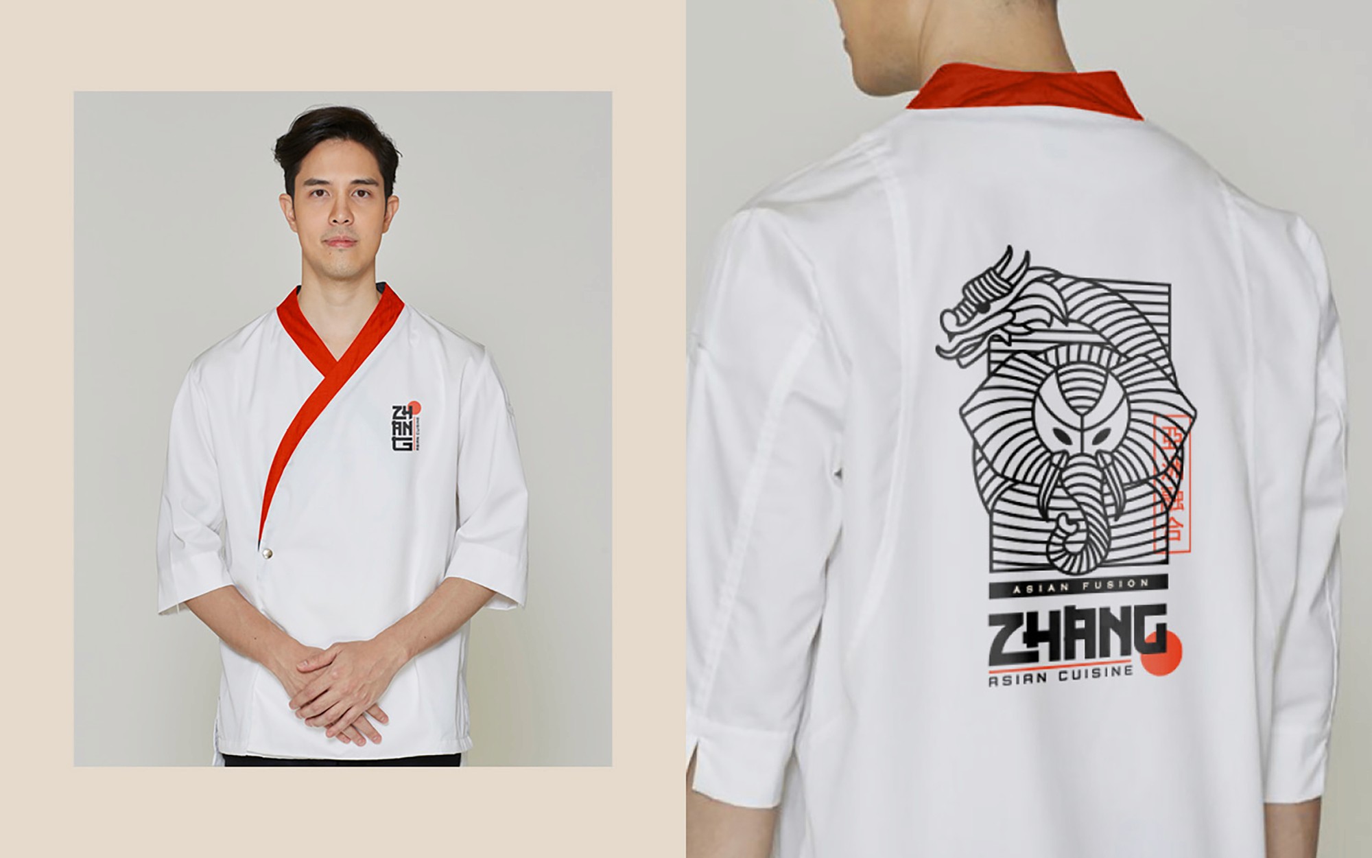
The secondary mark is a custom illustration of a dragon coiled around an elephant, representing the fusion at the heart of the brand: Asian and Indian cuisine brought together.