Packaging Design
Brand Identity

Client: Raw Urth
Scope: Packaging, Brand Identity.
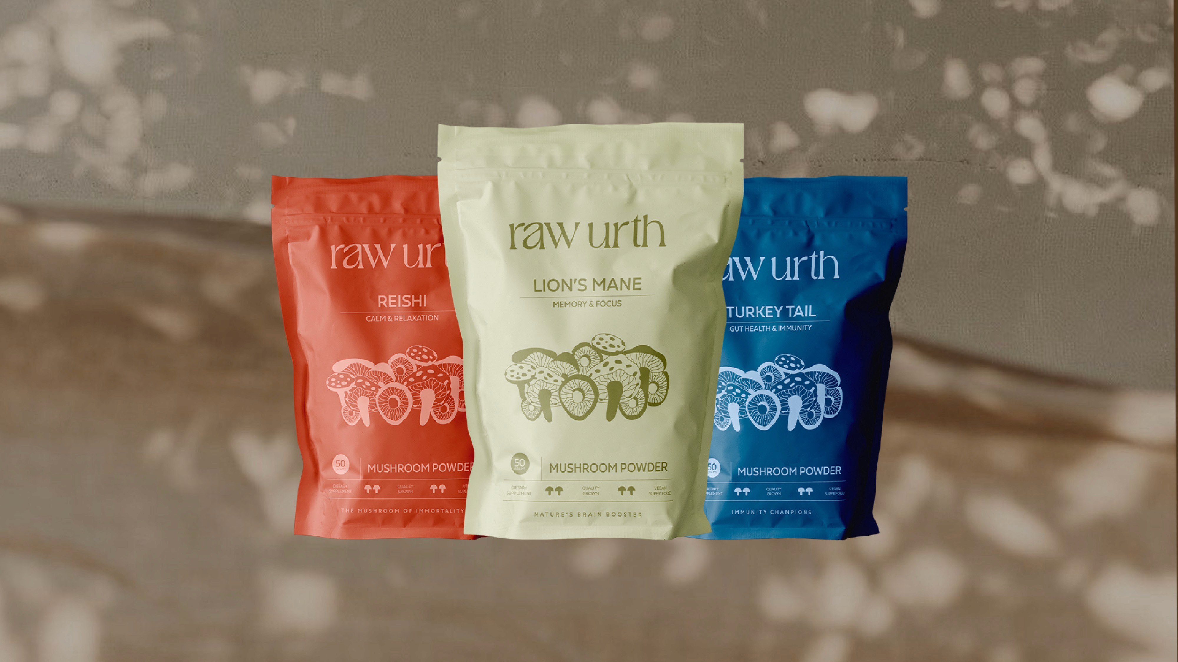
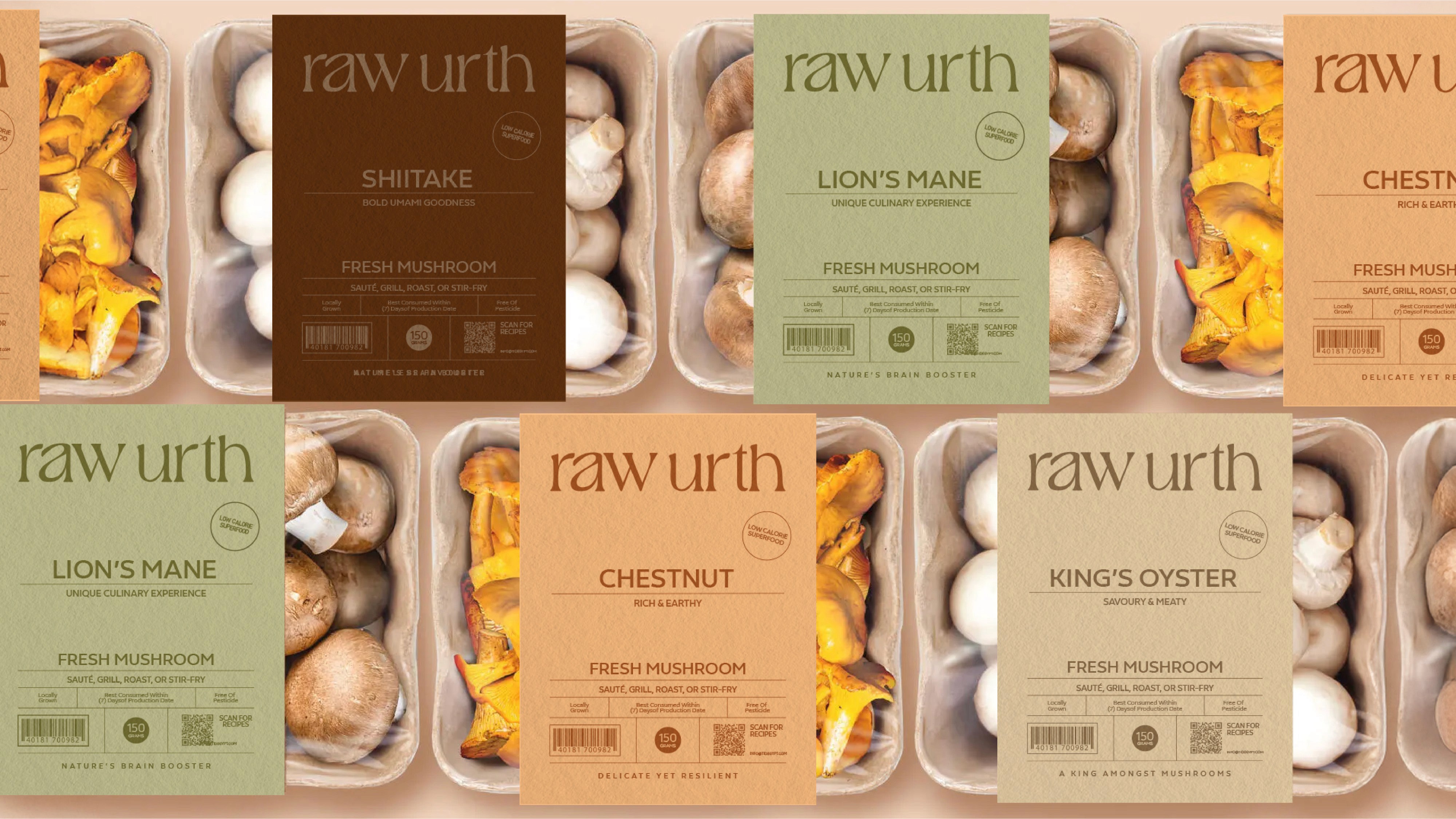
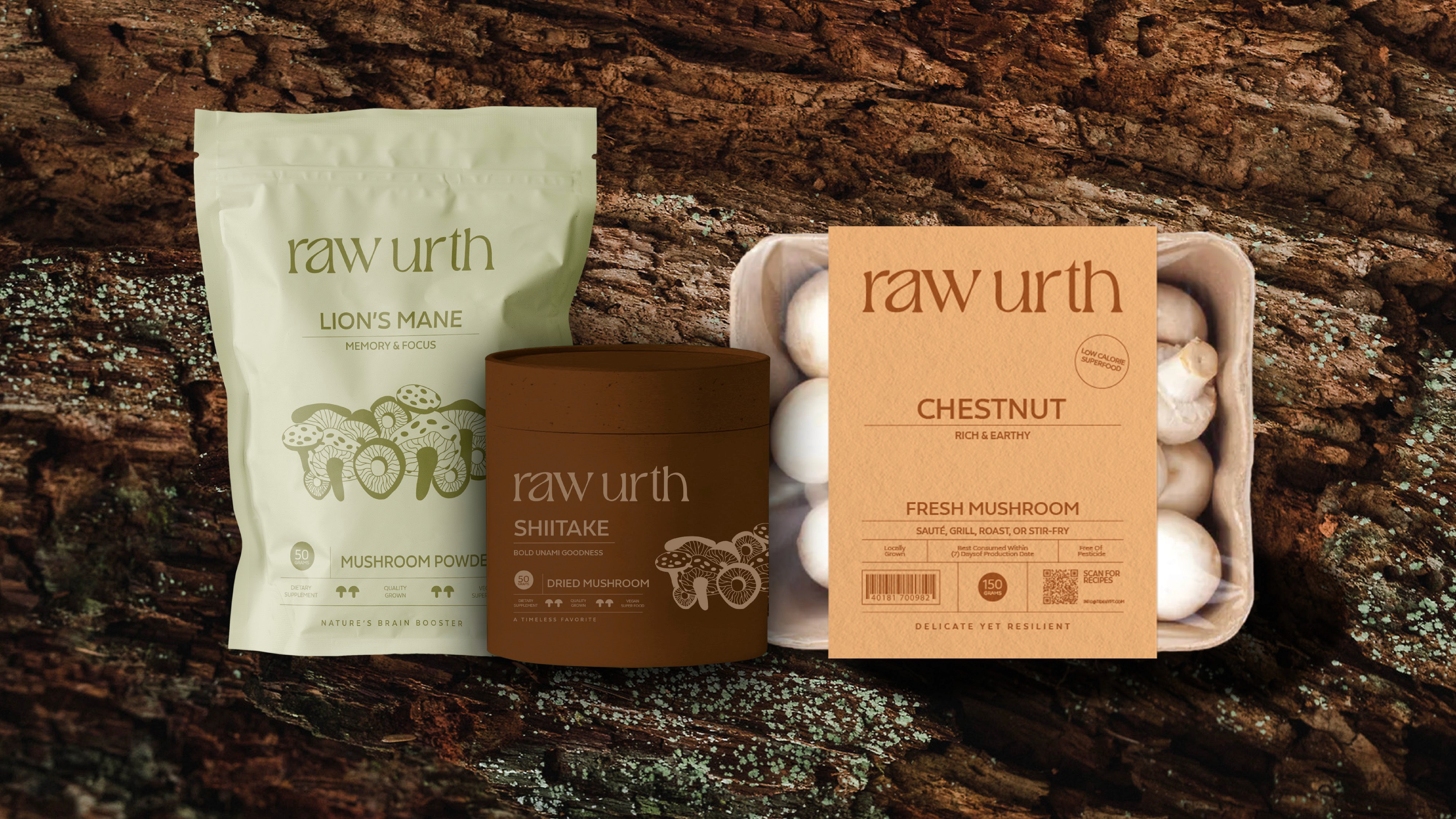
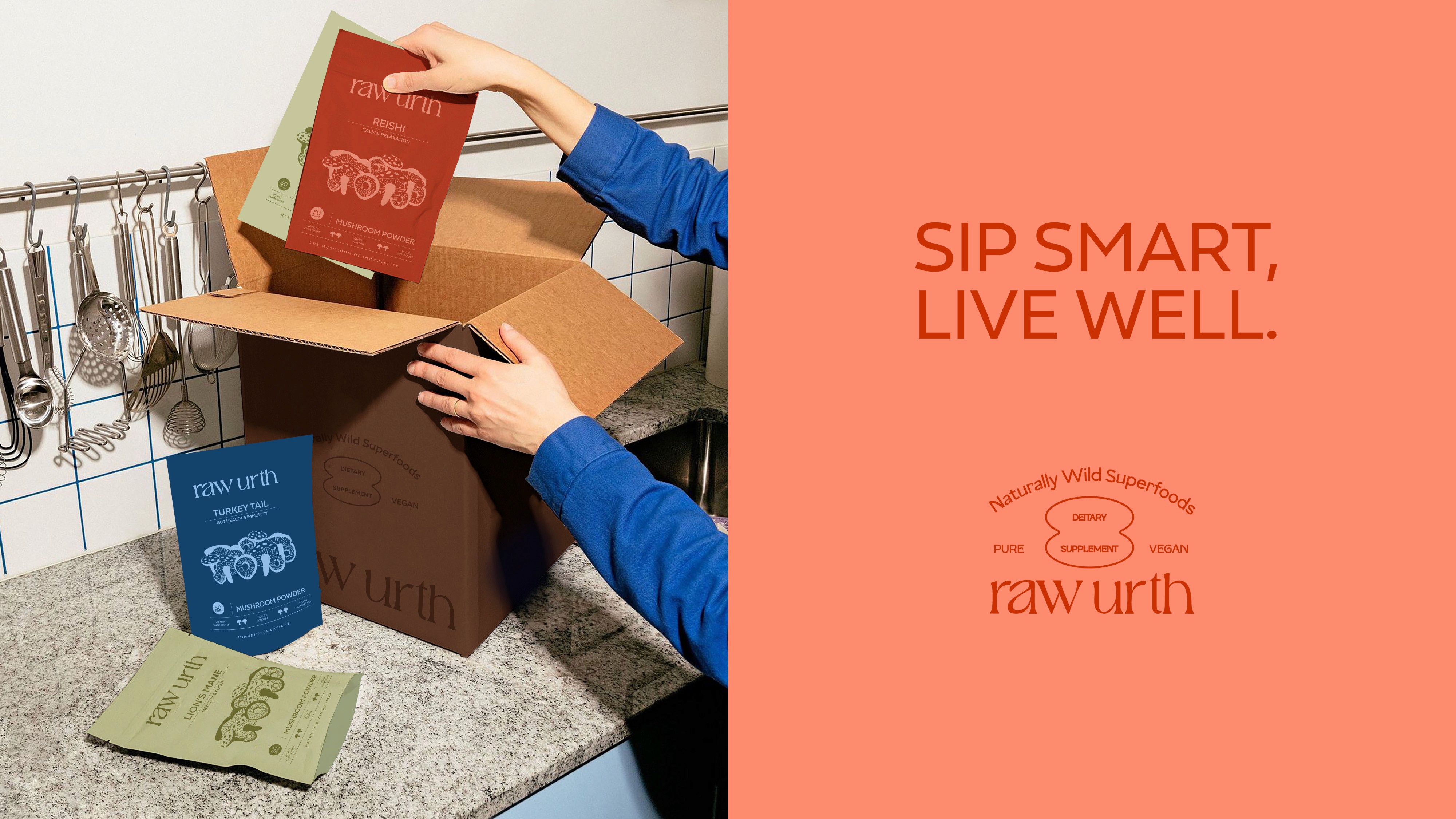
A mushroom brand built around multiple varieties, available in three product forms: fresh, dried, and powdered.
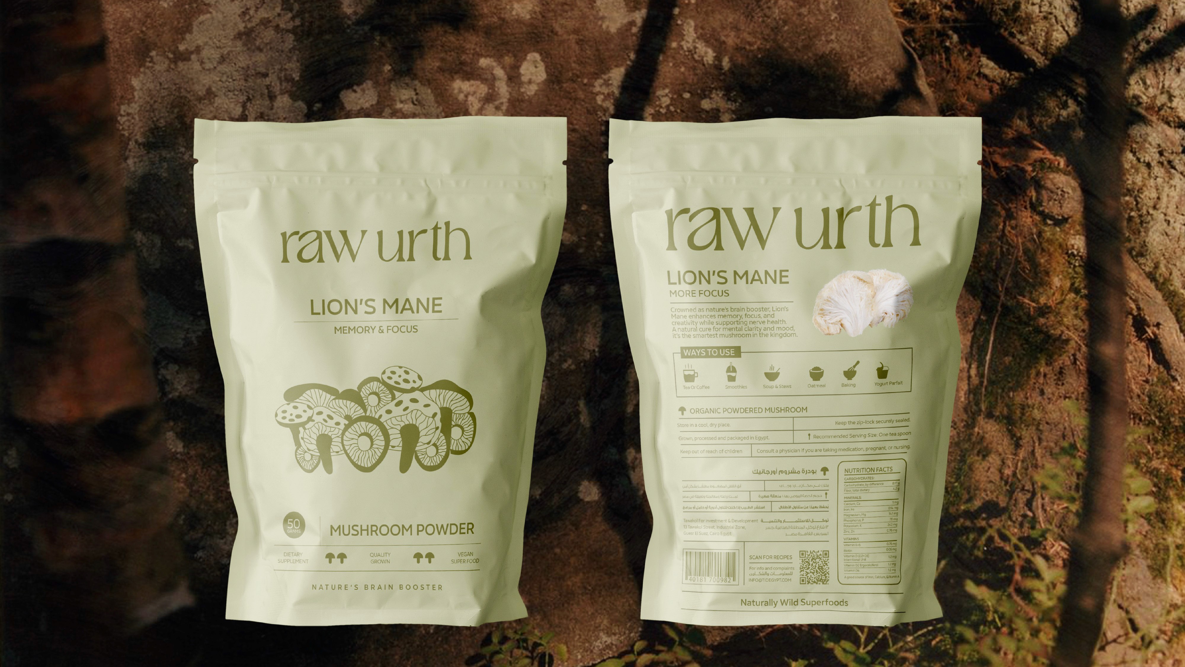
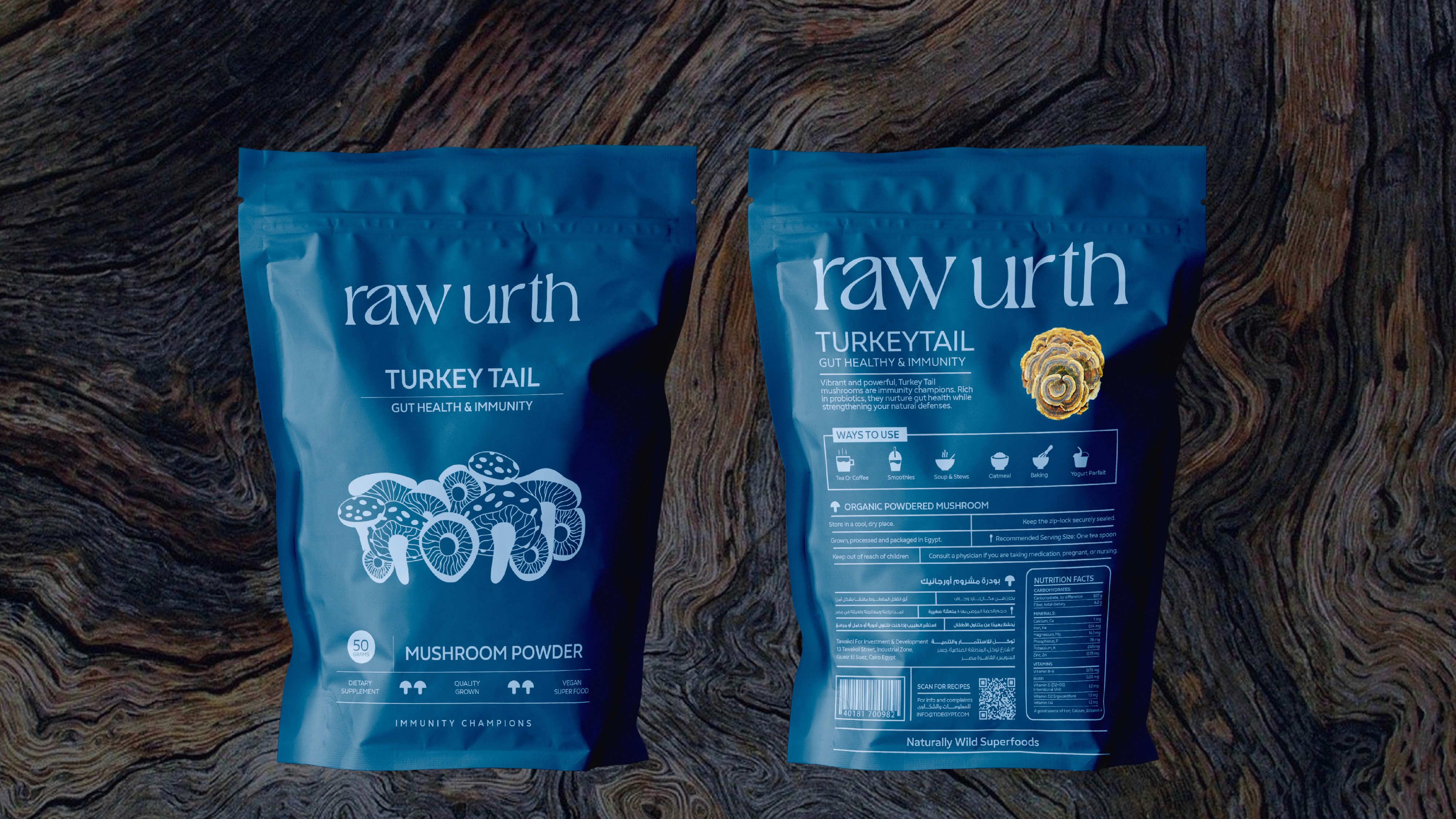
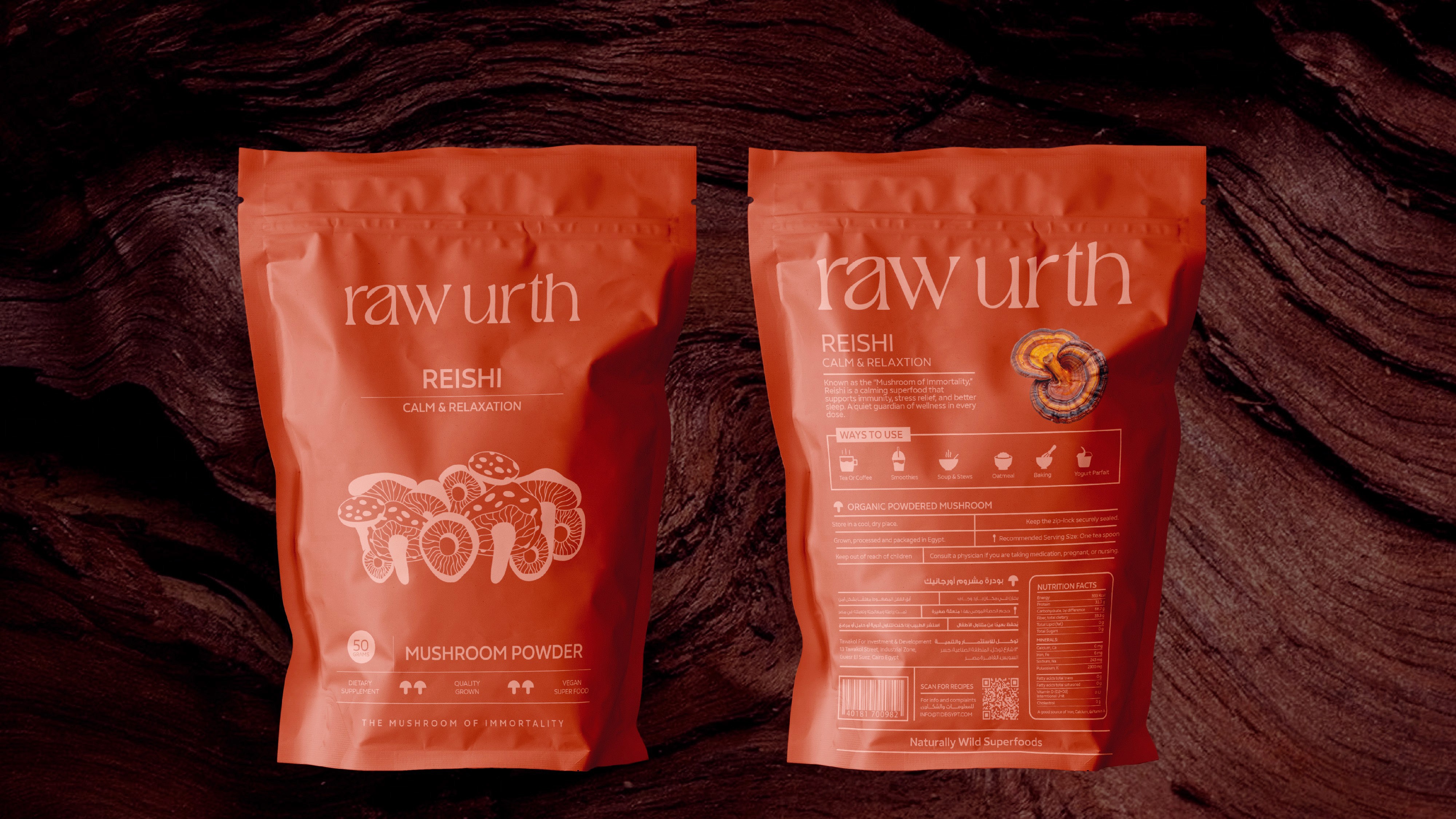
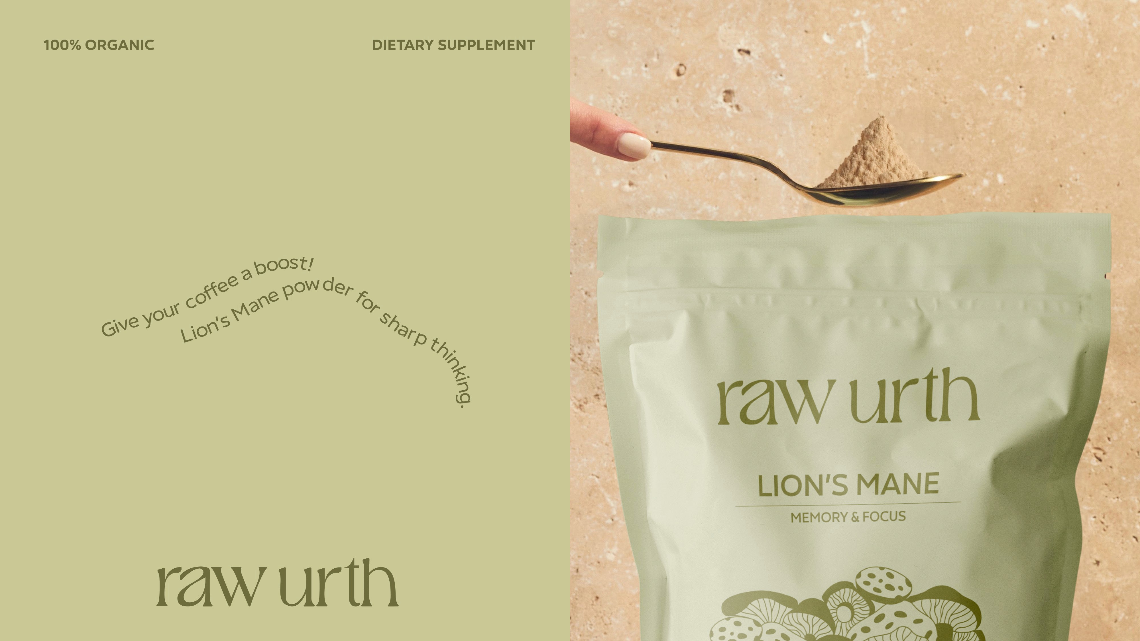
The wordmark sits in a refined serif that carries a subtle wild edge, letters that feel like they grew rather than were drawn. The letterforms take on the organic quality of the mushroom itself, soft and rounded in places, with a gentle irregularity that feels natural rather than accidental. Nothing loud. Just something that feels like it belongs to the earth.
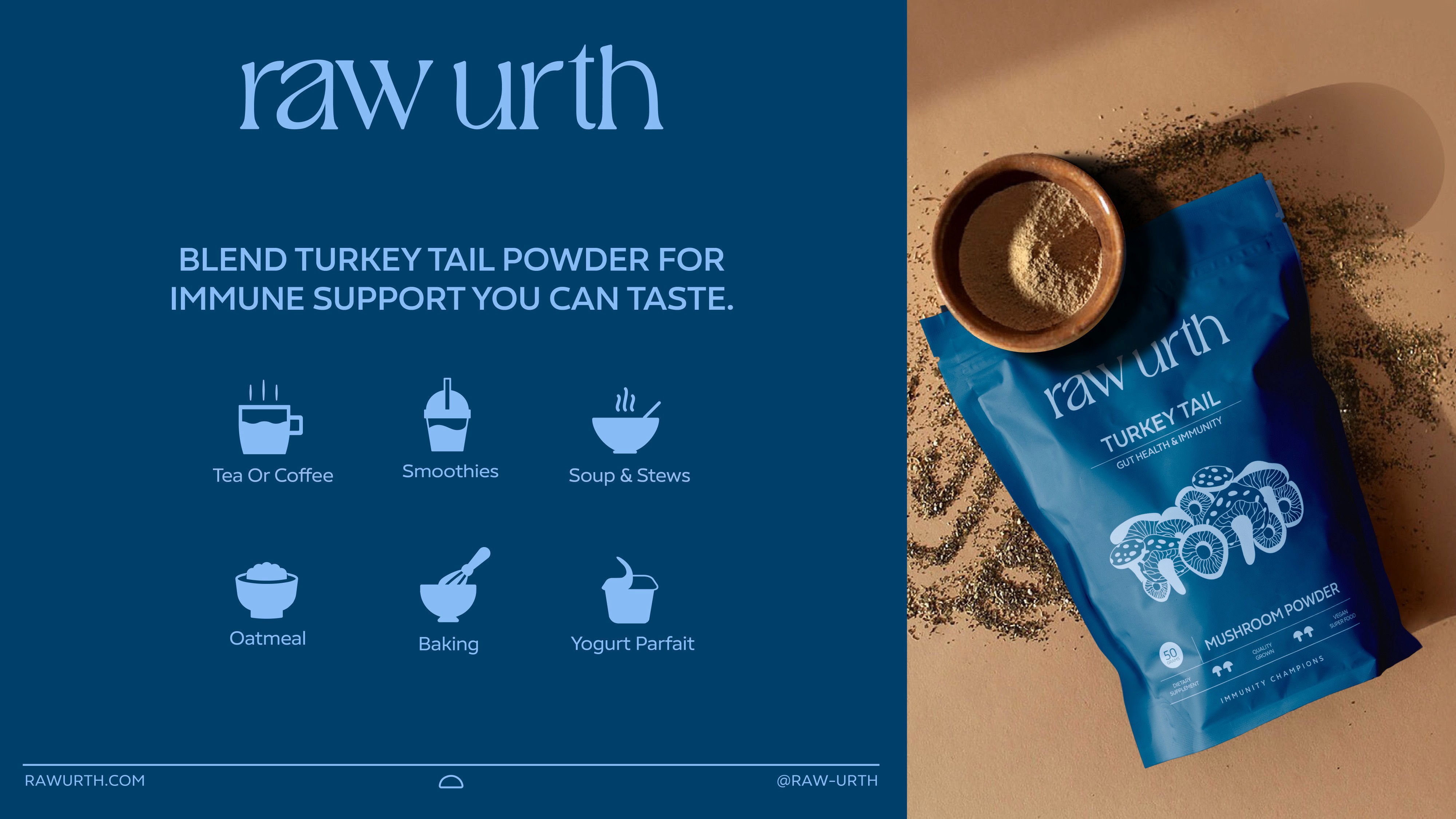
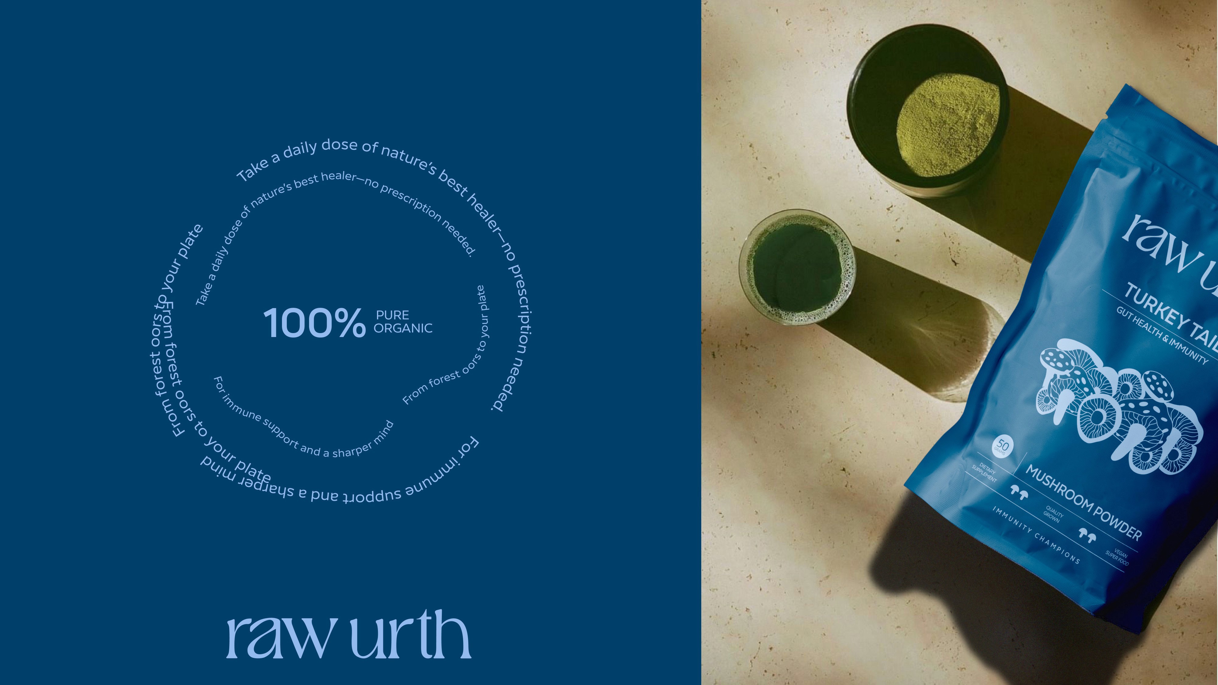
The mushrooms vary across three different product forms, each with its own packaging format. Fresh mushrooms in labelled trays. Dried in tubs. Powdered in resealable pouches.
The layout across every format is sleek and clean, generous space, clear hierarchy, nothing competing for attention. The wordmark sits large at the top, the variety name bold beneath it, the product form and benefit descriptor small and precise below that.
The illustration on the packs is detailed and rich without being decorative. It earns its place rather than just filling space.