Packaging Design
Brand Identity

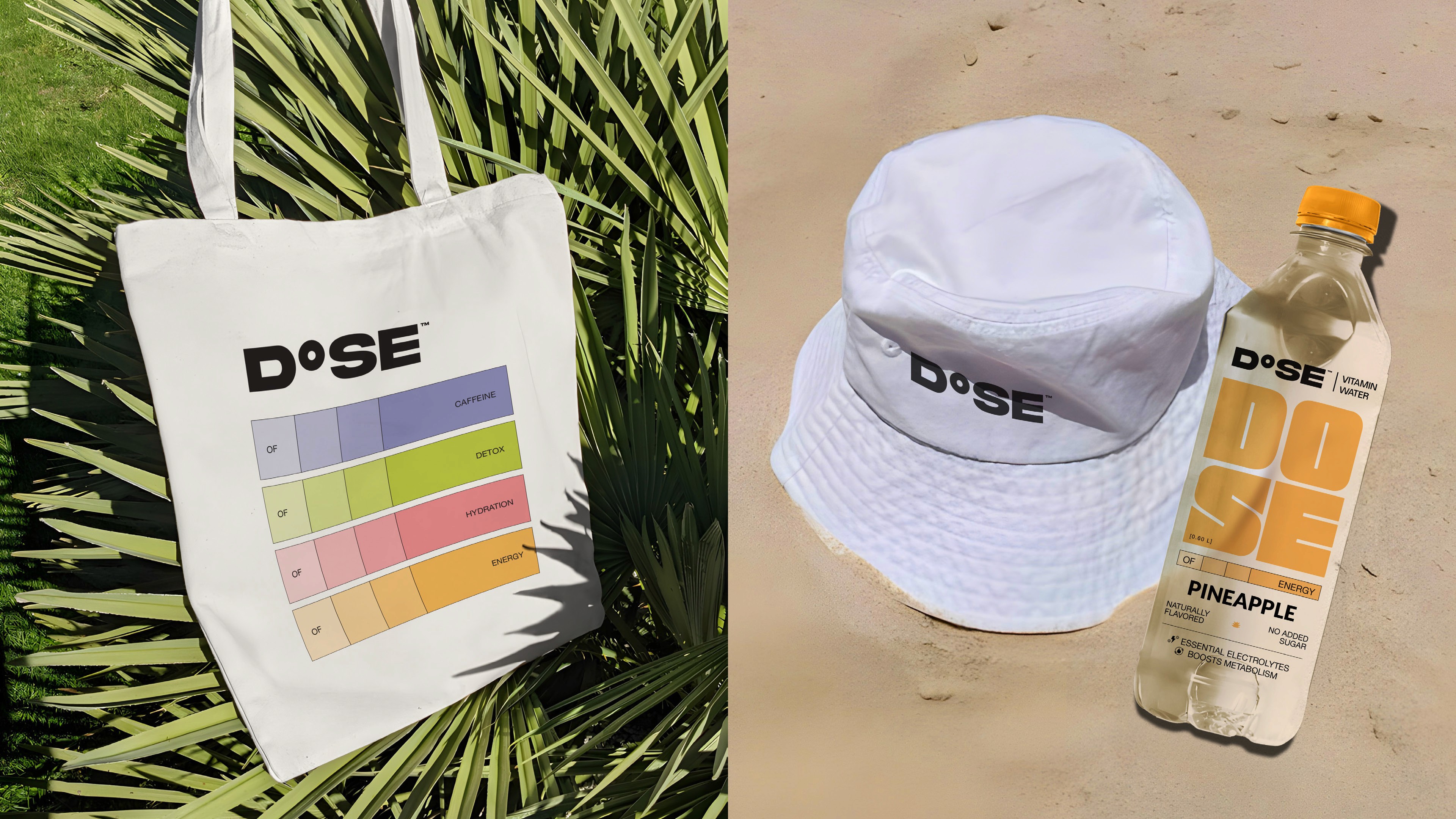
Client: D°SE Water
Scope: Visual Identity, Packaging Design.
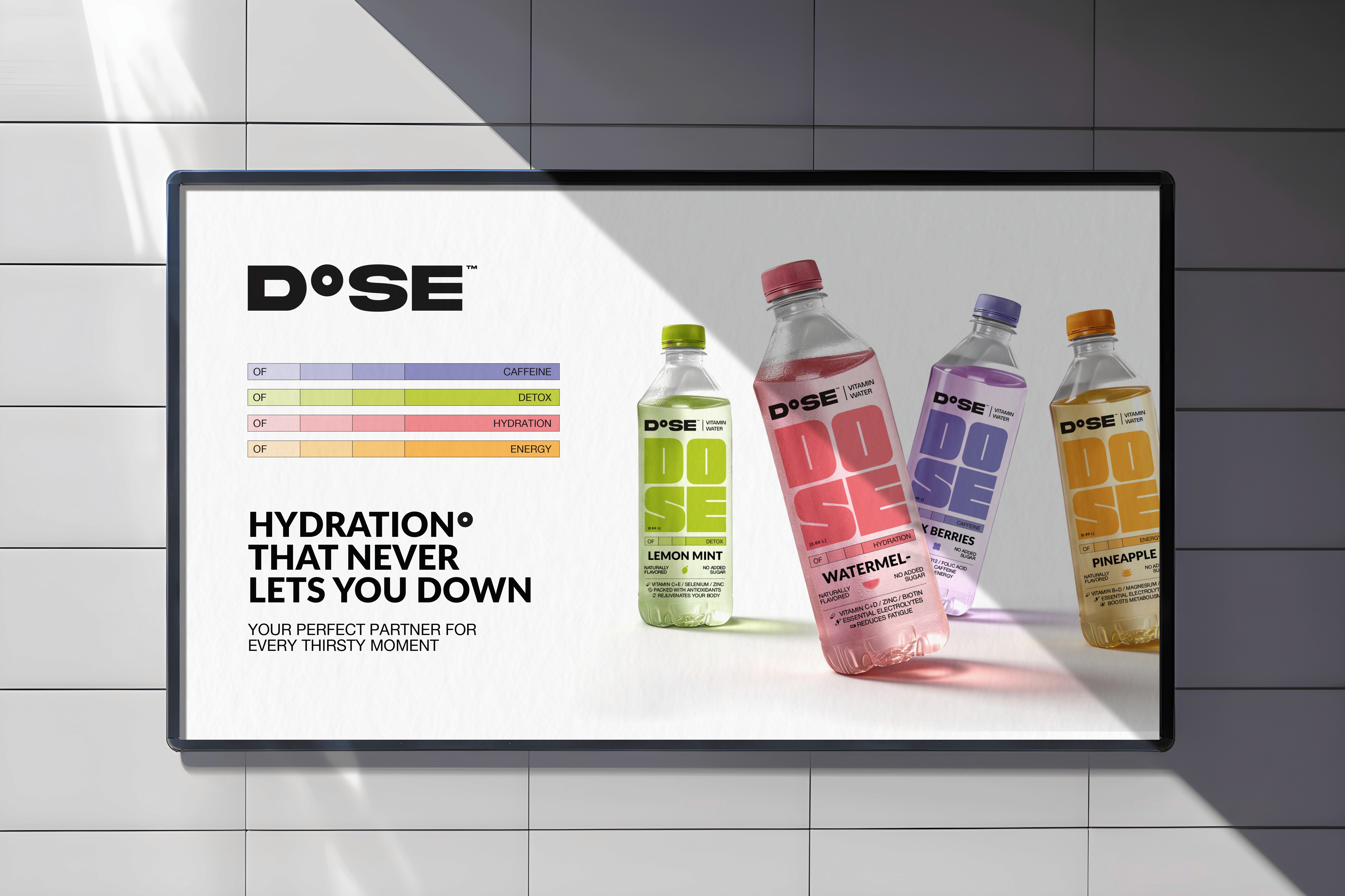
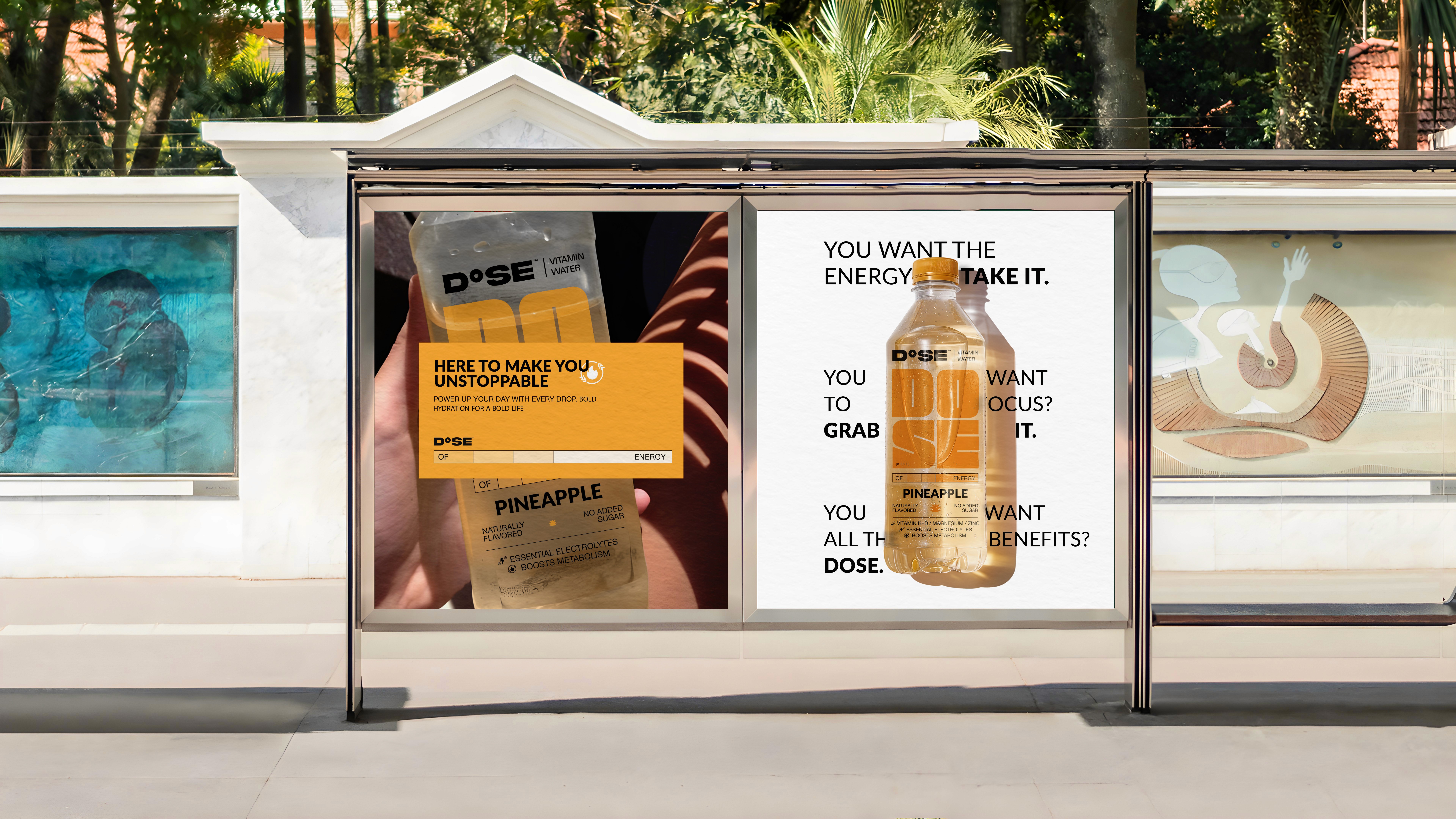
D°SE was built from the ground up. Brand identity, packaging system, campaign, and merch. All originated from a single idea: hydration as a precise formula, not a wellness feeling.
The challenge was introducing a category that didn't exist in the market yet. It needed to read clearly as something new without confusing people into thinking it was juice or soda, and without feeling so clinical or foreign that it pushed first-time buyers away
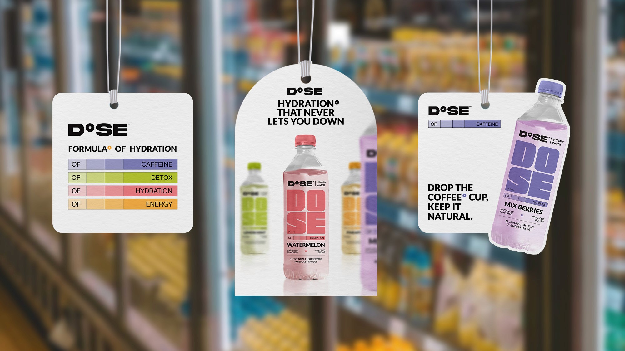
The concept is built around a progression bar, a visual device borrowed from the logic of a periodic table entry, that communicates how much of your daily dose each variant delivers.
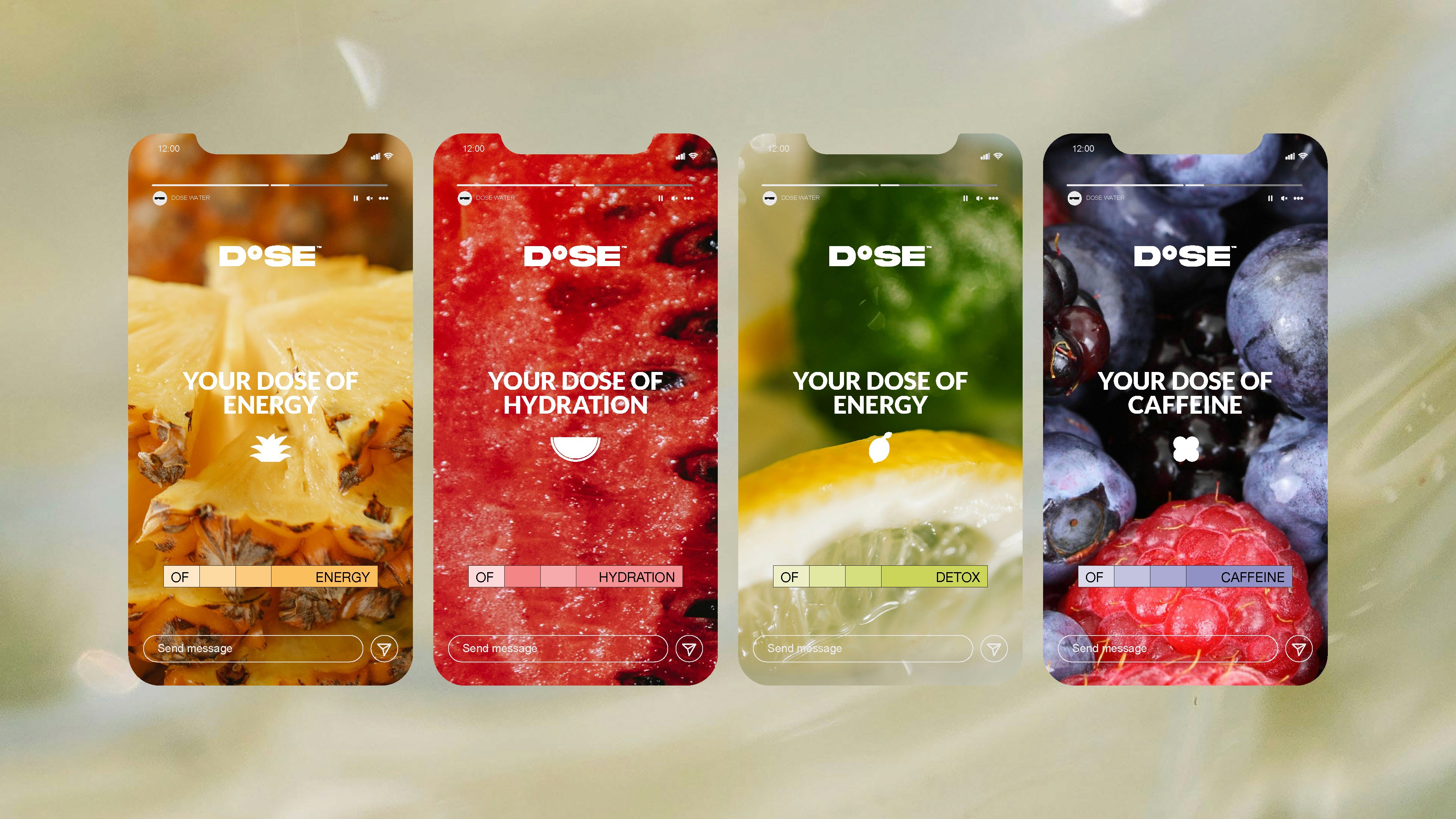
Four formulas. Four colour worlds. One system.