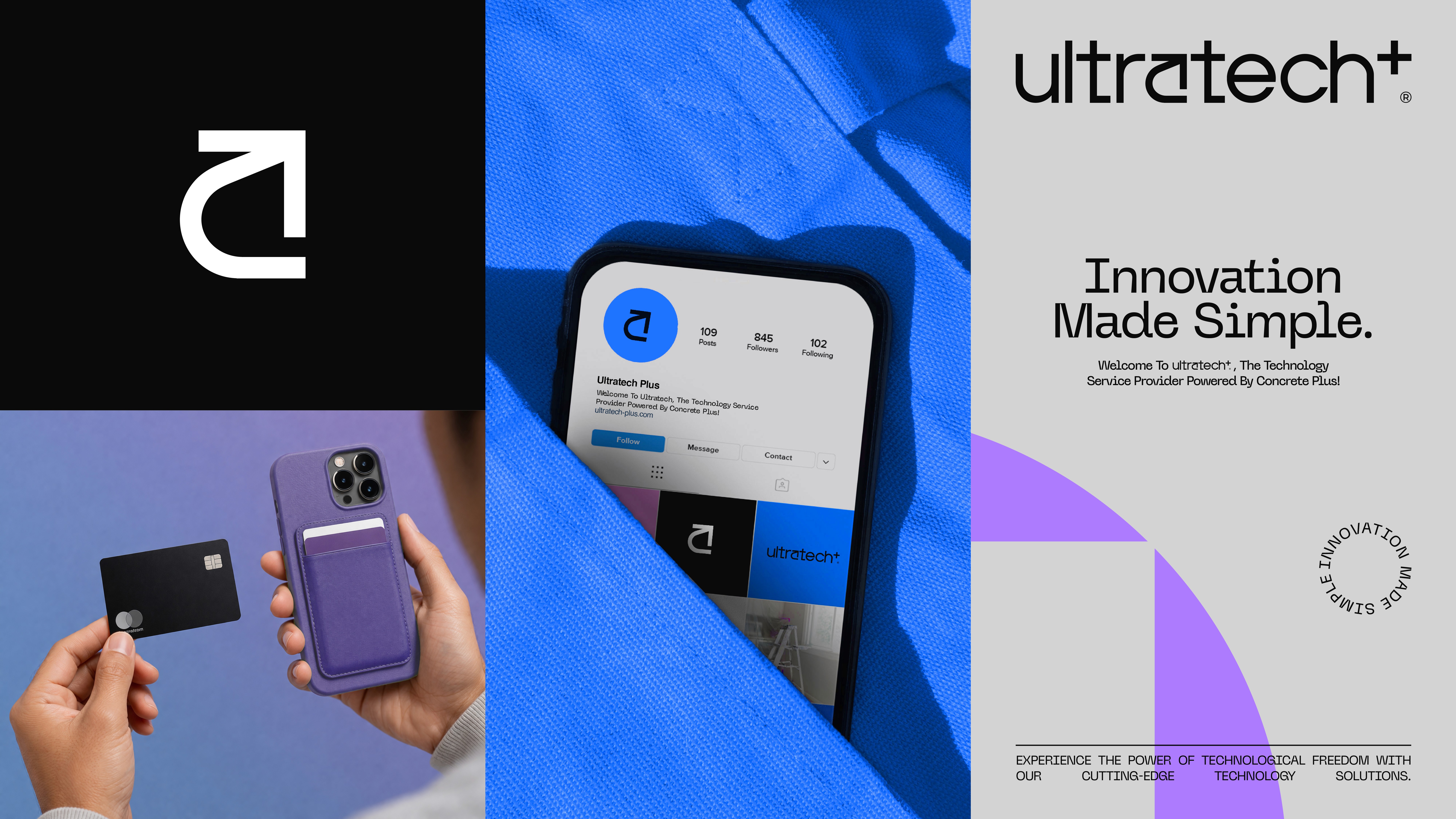
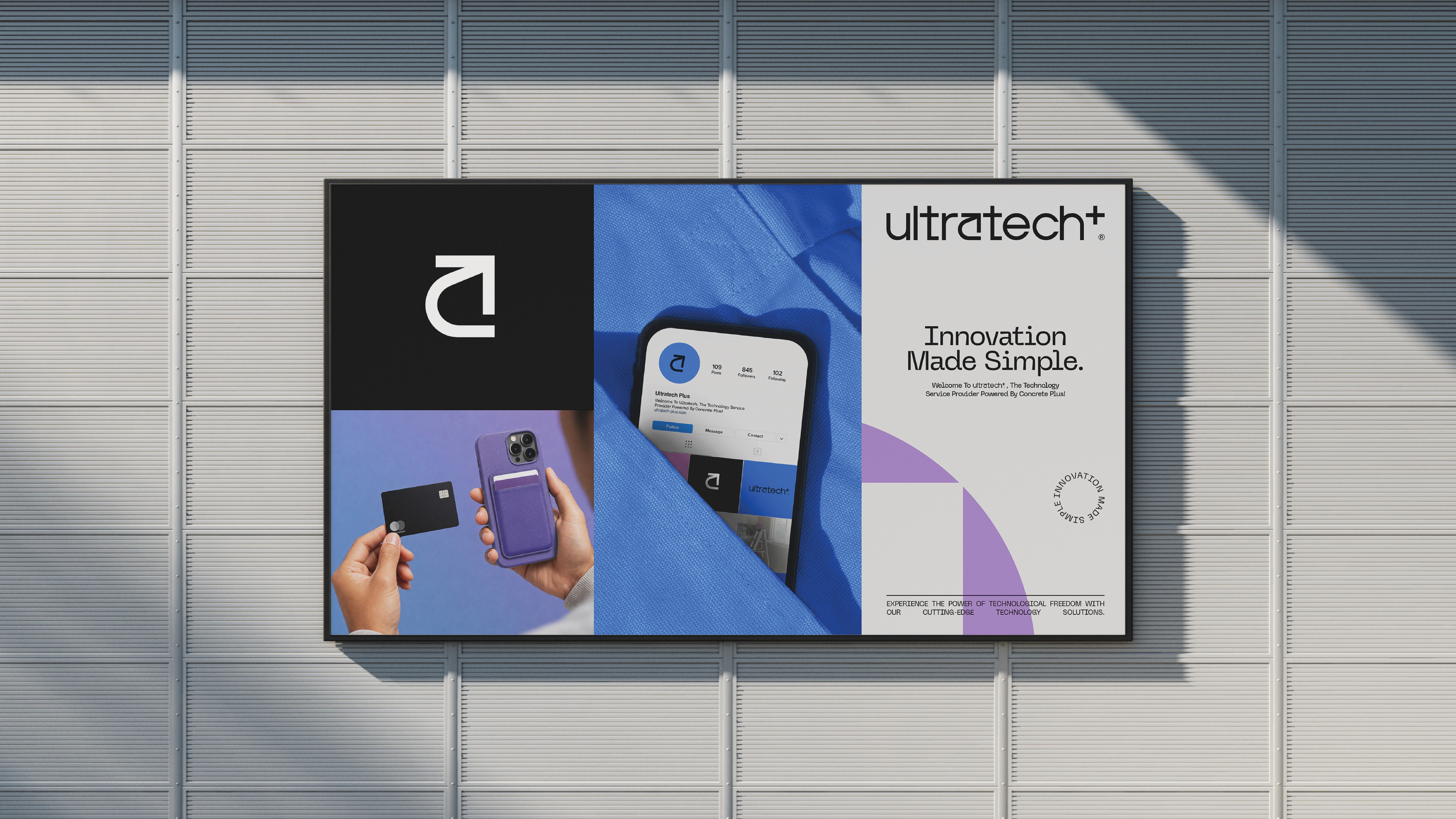
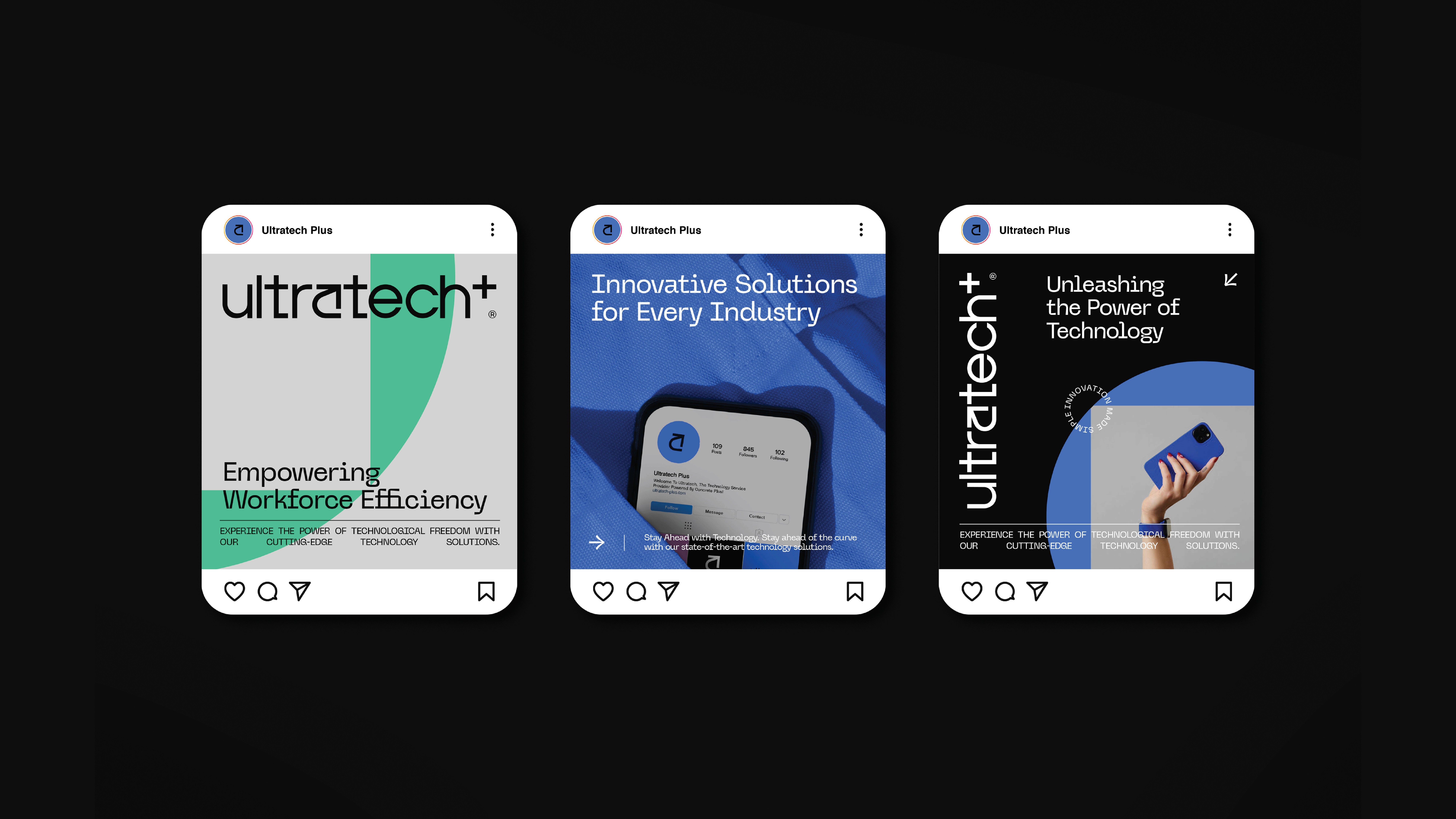
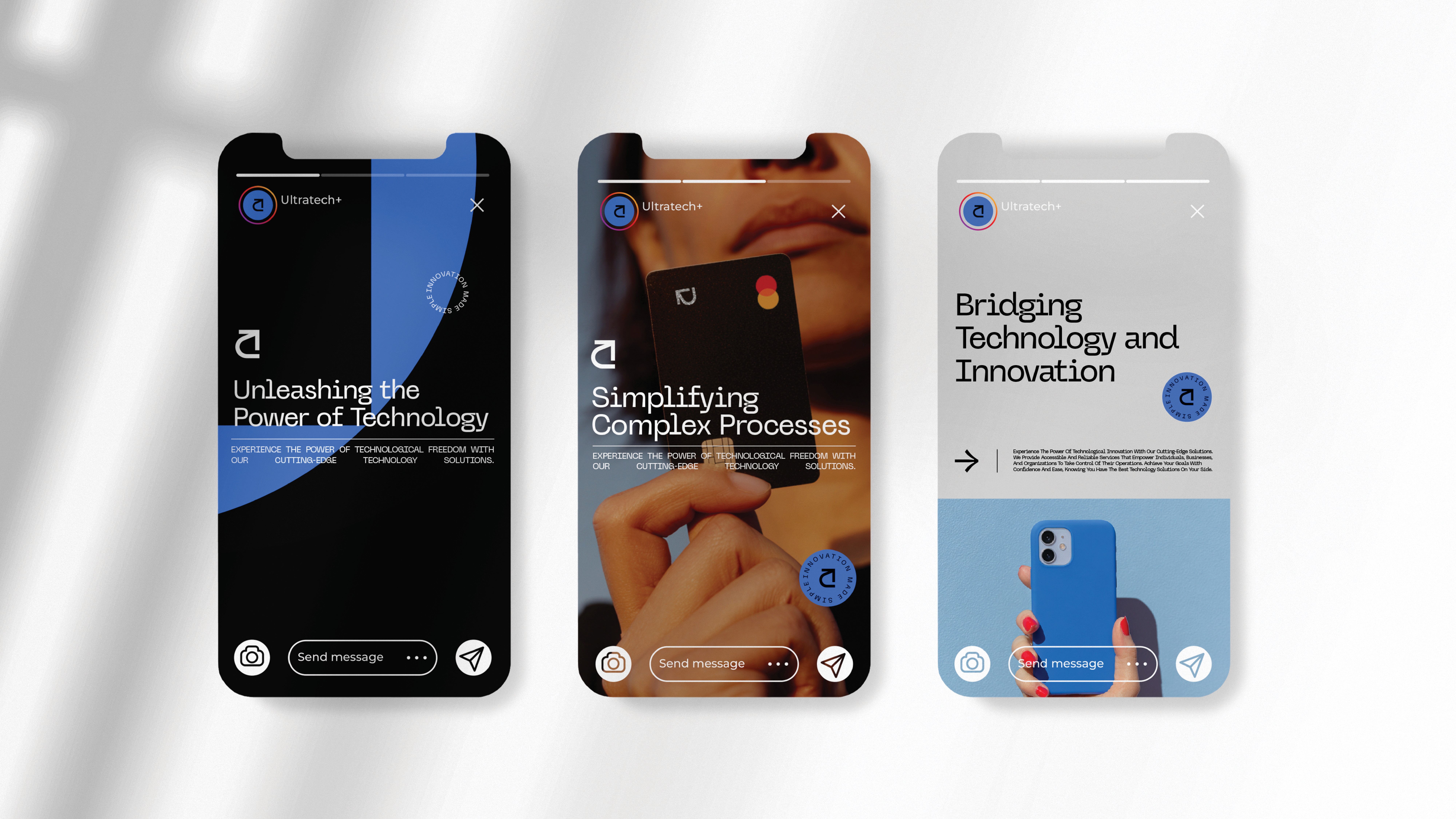
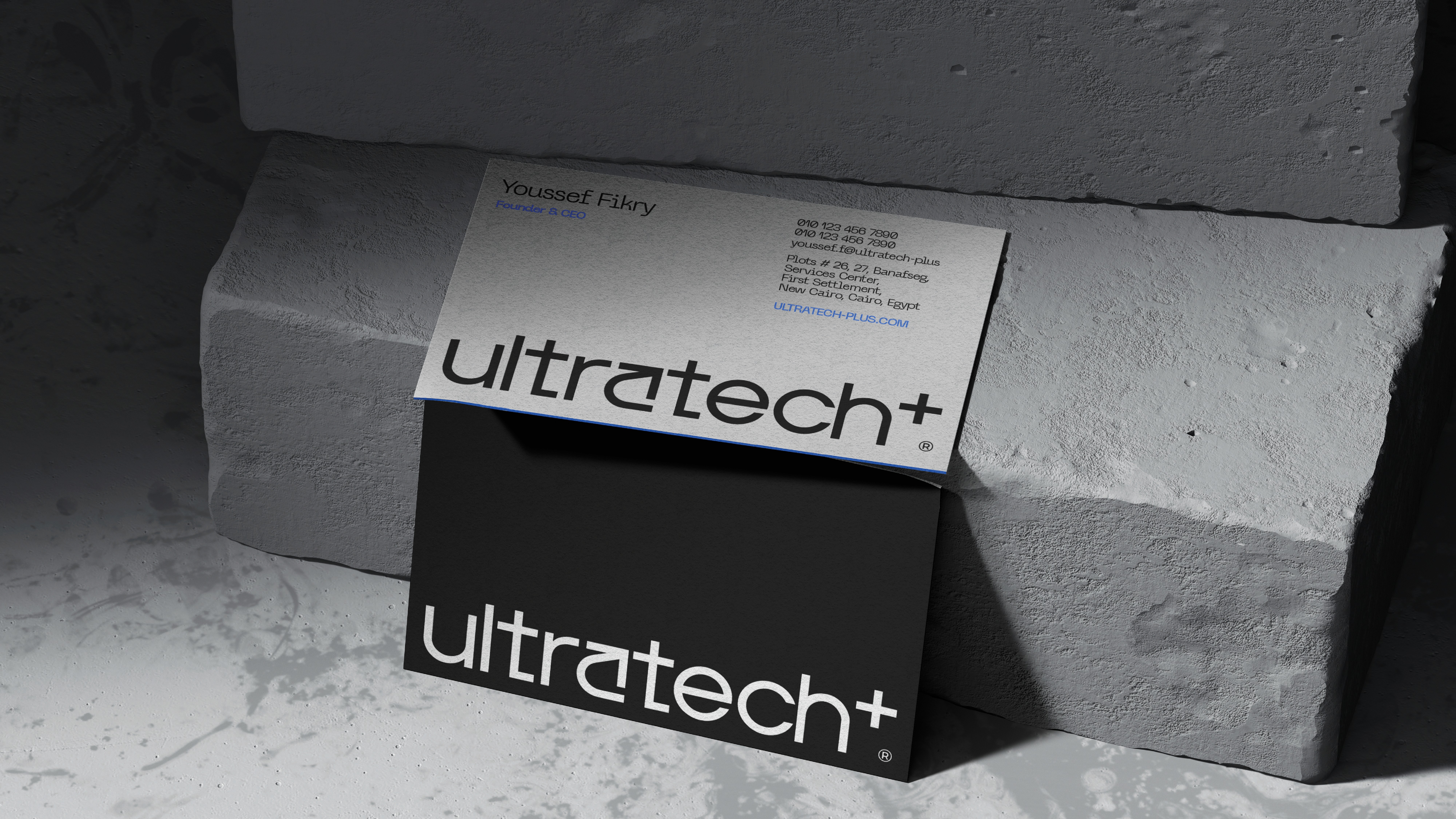
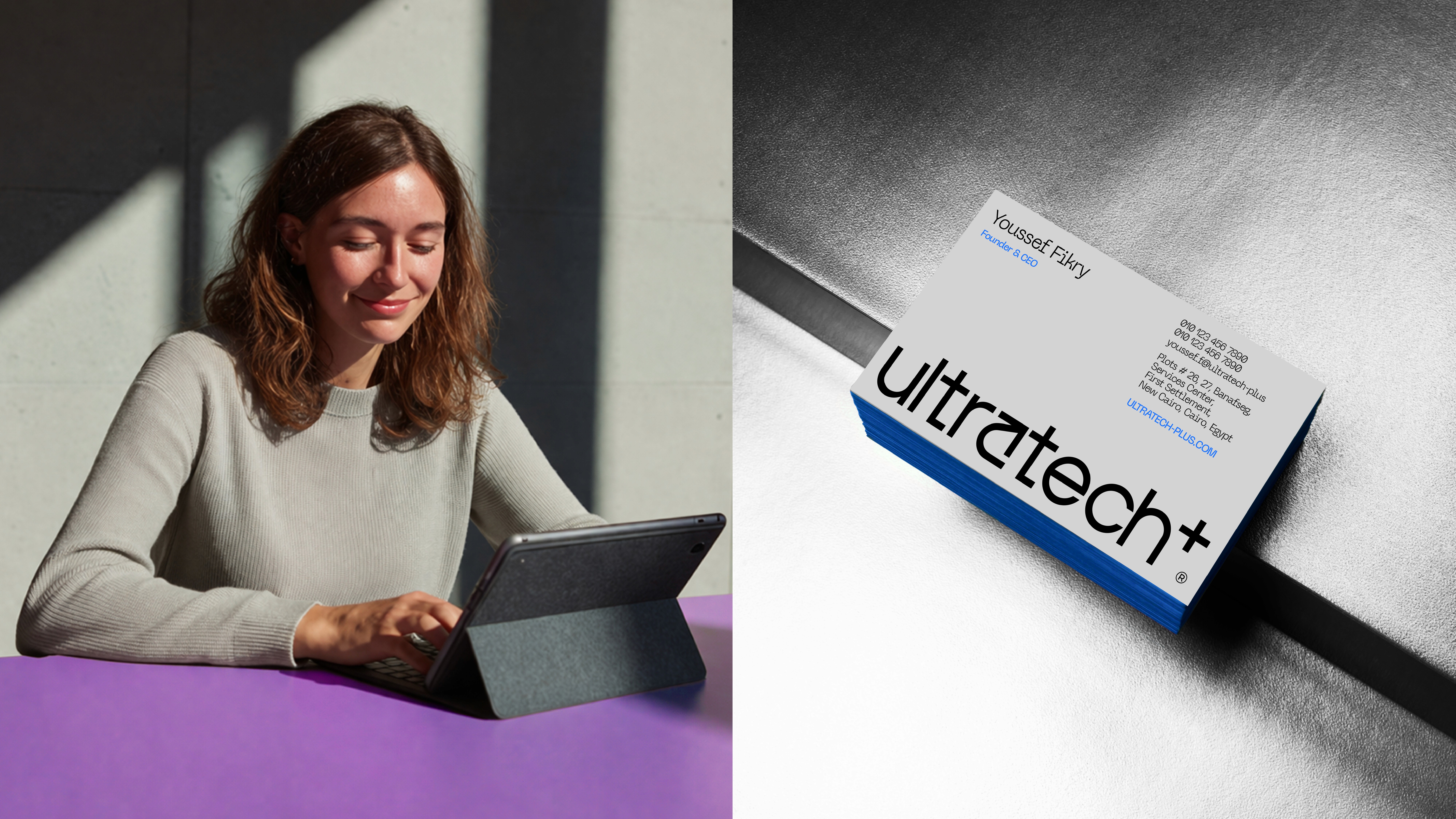
Brand Identity

LOGO CONCEPT
The logo is built on a precise geometric structure, creating a sense of stability and balance.
Its form communicates reliability and control, while maintaining a contemporary feel aligned with fintech innovation. The simplicity allows it to scale across digital and physical applications without losing clarity.

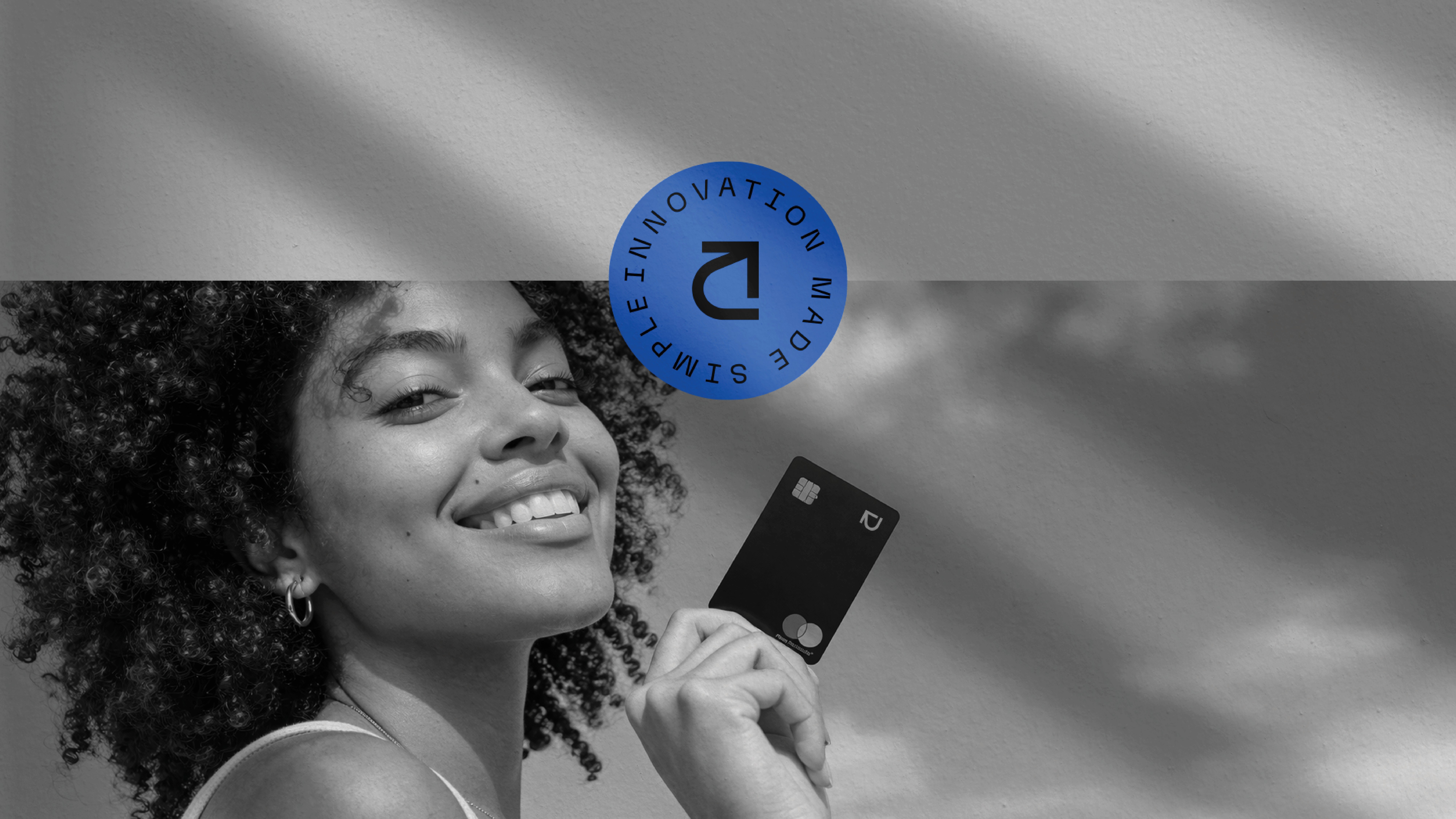
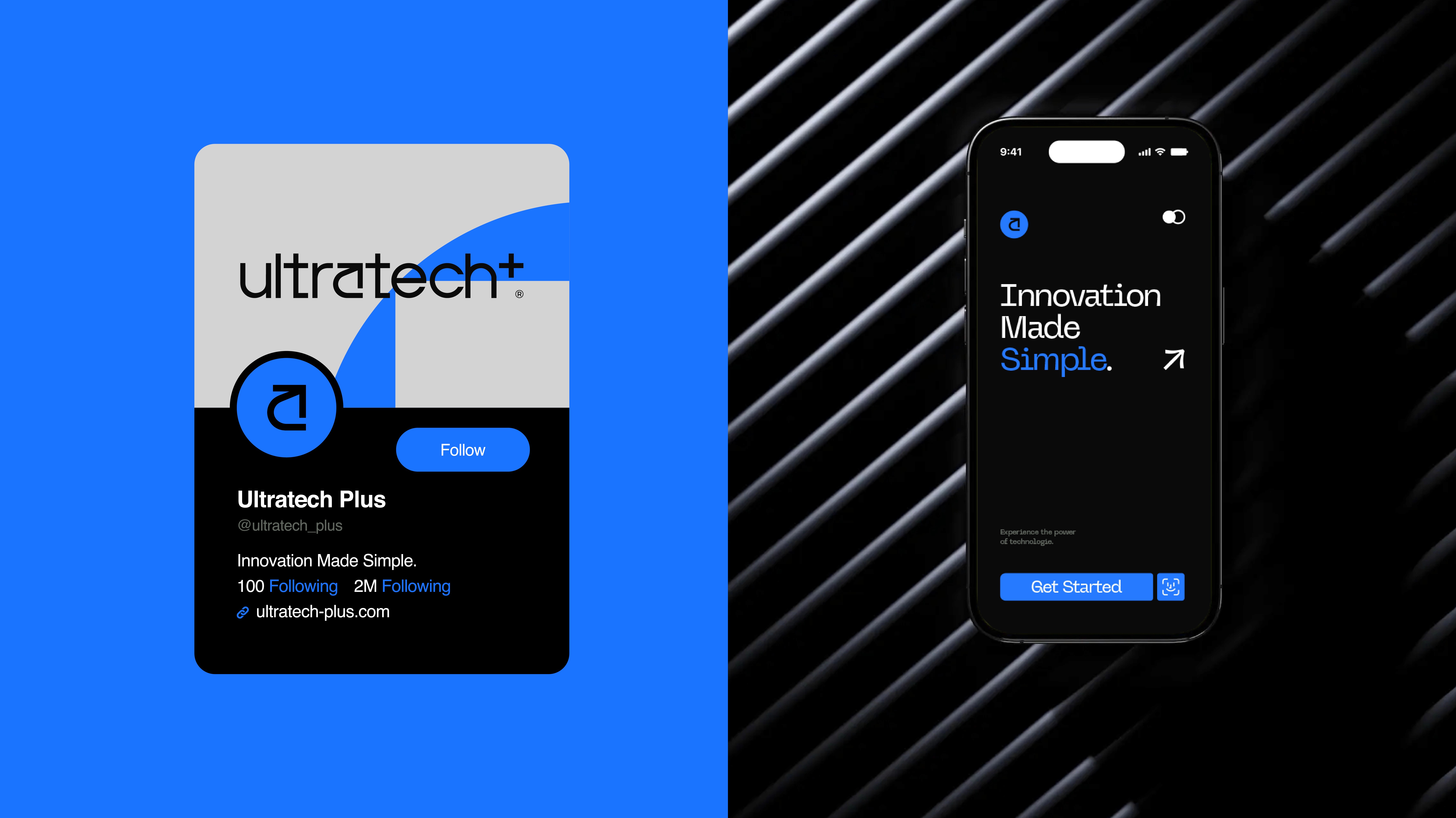
A/ARROW
The forward-pointing arrow represents growth, progress, and direction.
It reflects the brand’s role in guiding users through their financial journey, supporting movement toward better decisions, higher goals, and long-term success.
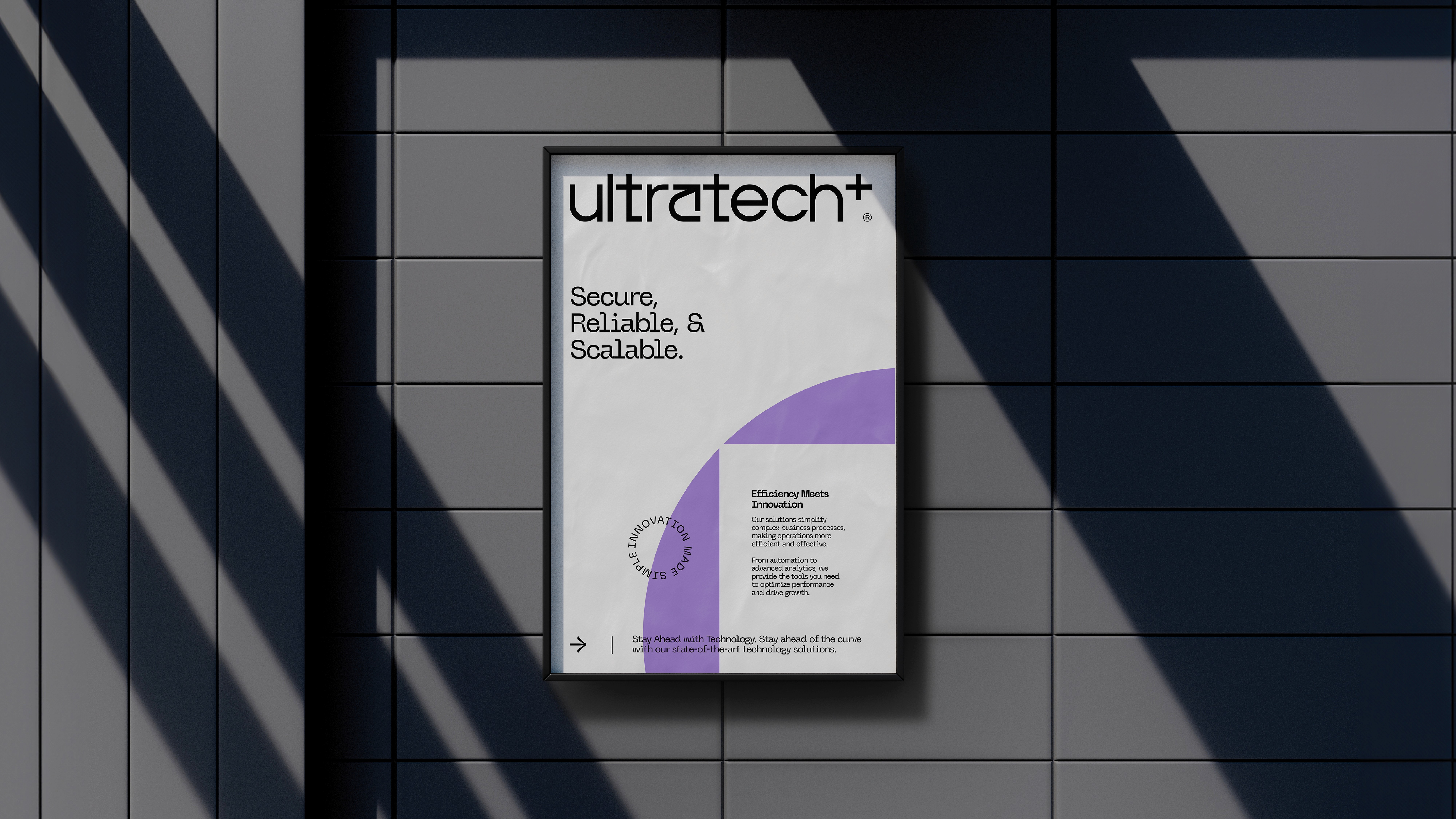
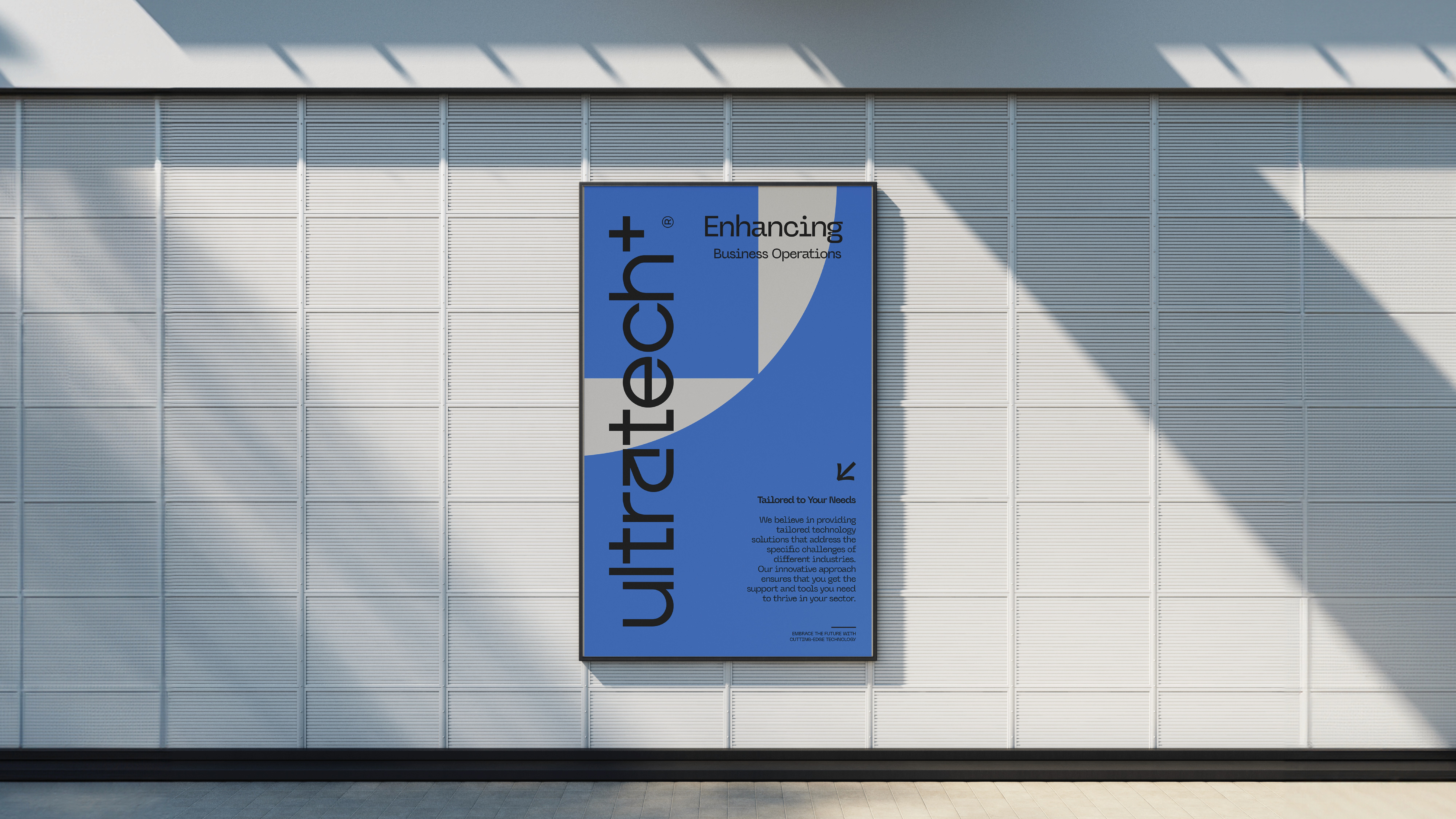
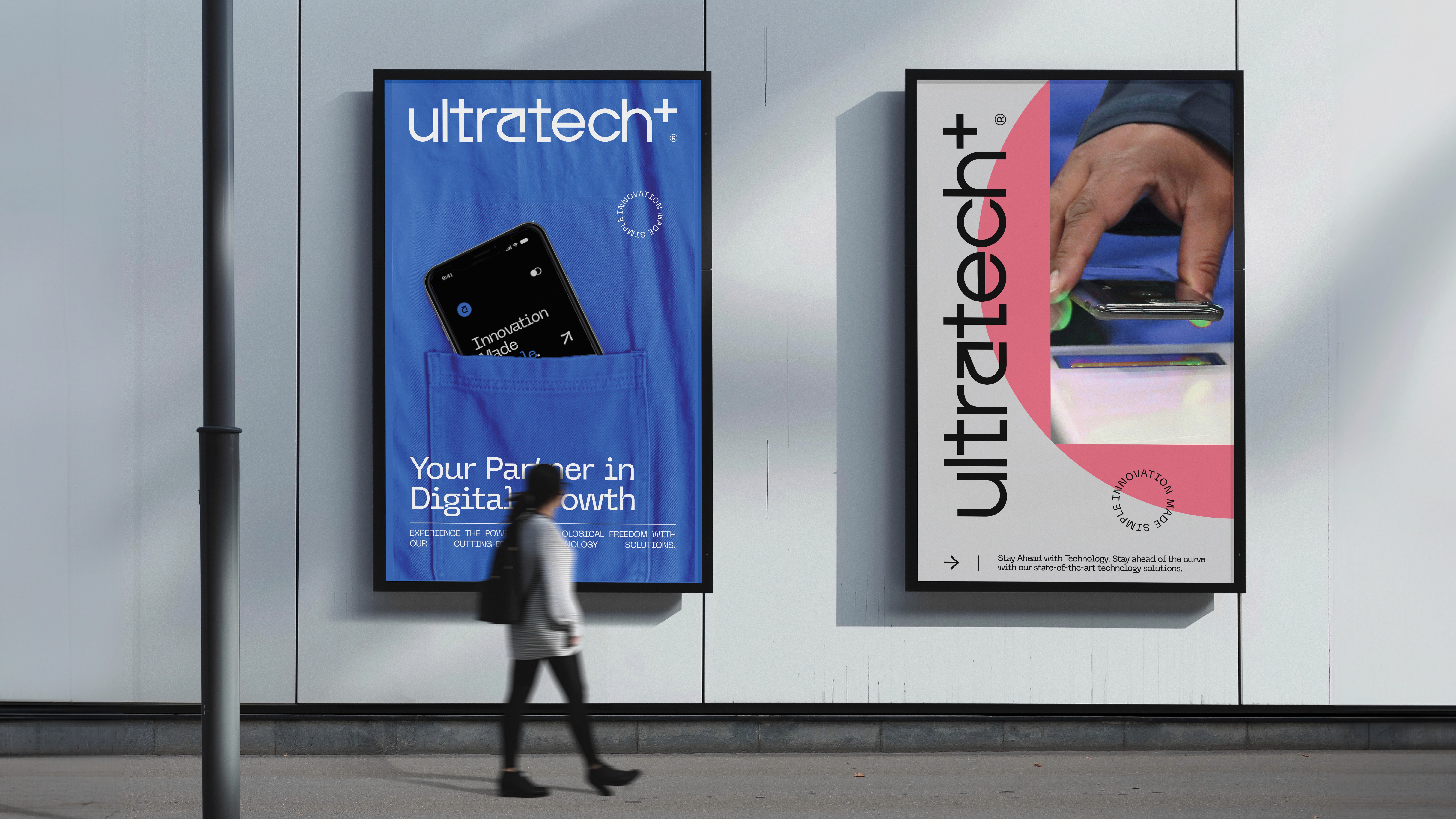
COLOUR SYSTEM
The colour system balances authority with accessibility.
Black acts as the foundation, reinforcing strength, reliability, and sophistication.
A neutral grey introduces clarity and structure, improving readability across applications.
Blue tones represent innovation and trust, while subtle purple, mint and coral pink accents add a sense of creativity and inclusivity.

CORE CONCEPT : INTERCONNECTIVITY
At the core of the identity is the idea of interconnectivity.
The integration of geometric forms represents the connection between users, systems, and financial tools. It reflects a platform designed to be inclusive, accessible, and adaptable to different user needs.
Ultratech+ bridges the gap between complexity and usability, creating a seamless financial experience for a diverse audience.

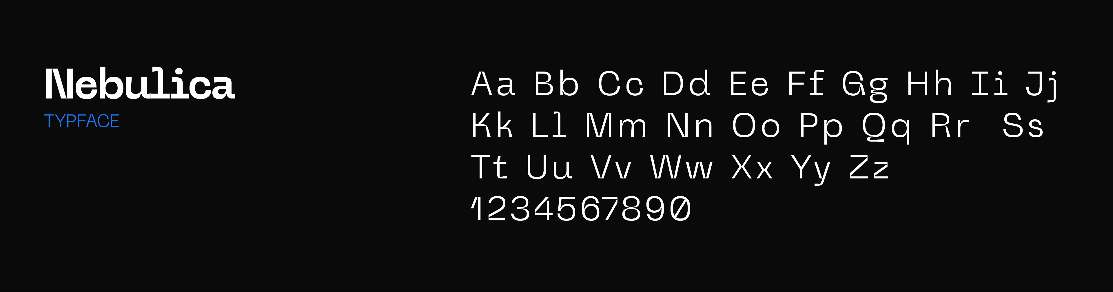
TYPOGRAPHY
Nebulica was selected for its balance between geometric precision and modern character.
Its structure ensures clarity across digital interfaces while maintaining a distinctive visual tone. Details like angled cuts and subtle ink traps give the typeface a contemporary edge without compromising legibility.