Packaging Design
Brand Identity

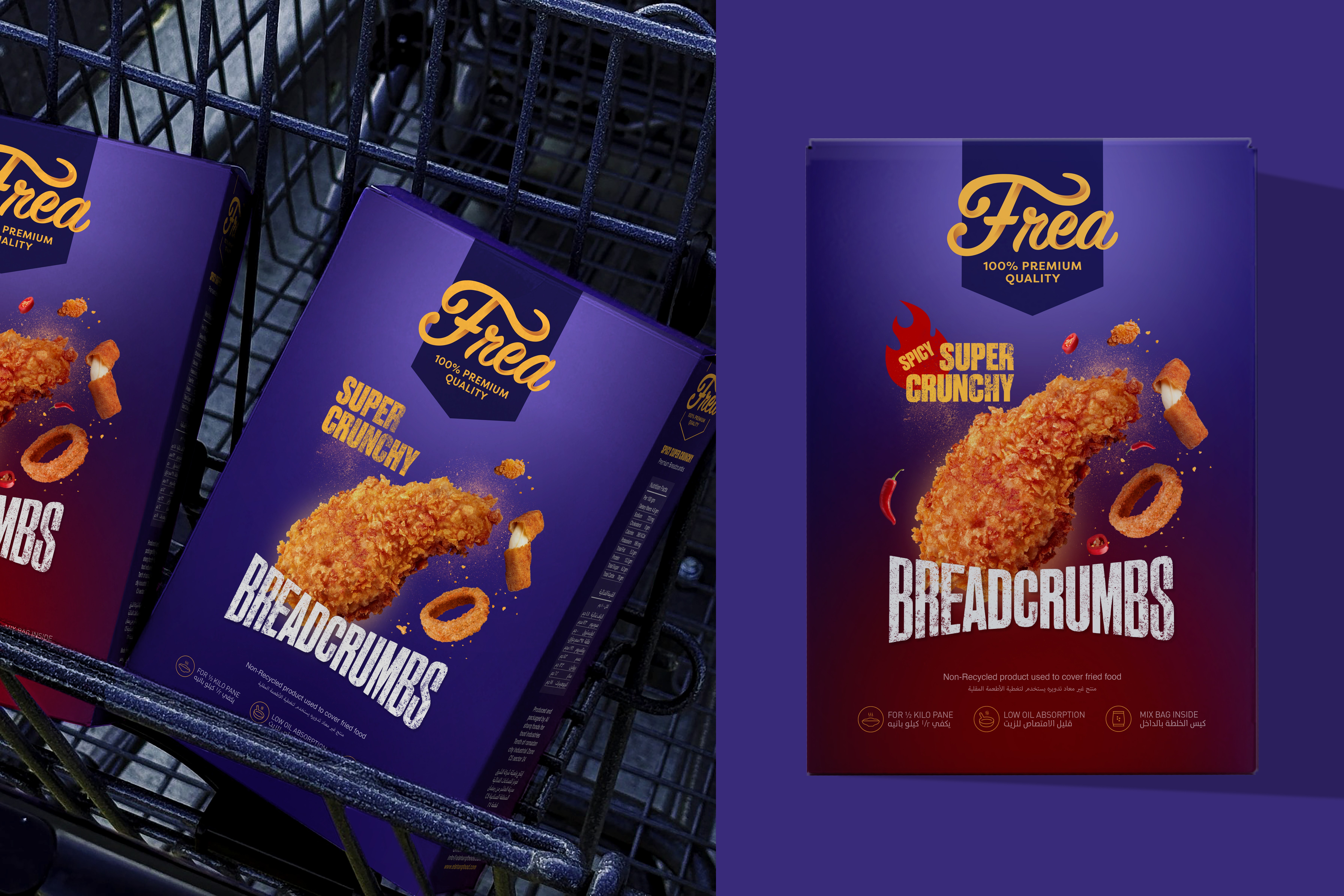
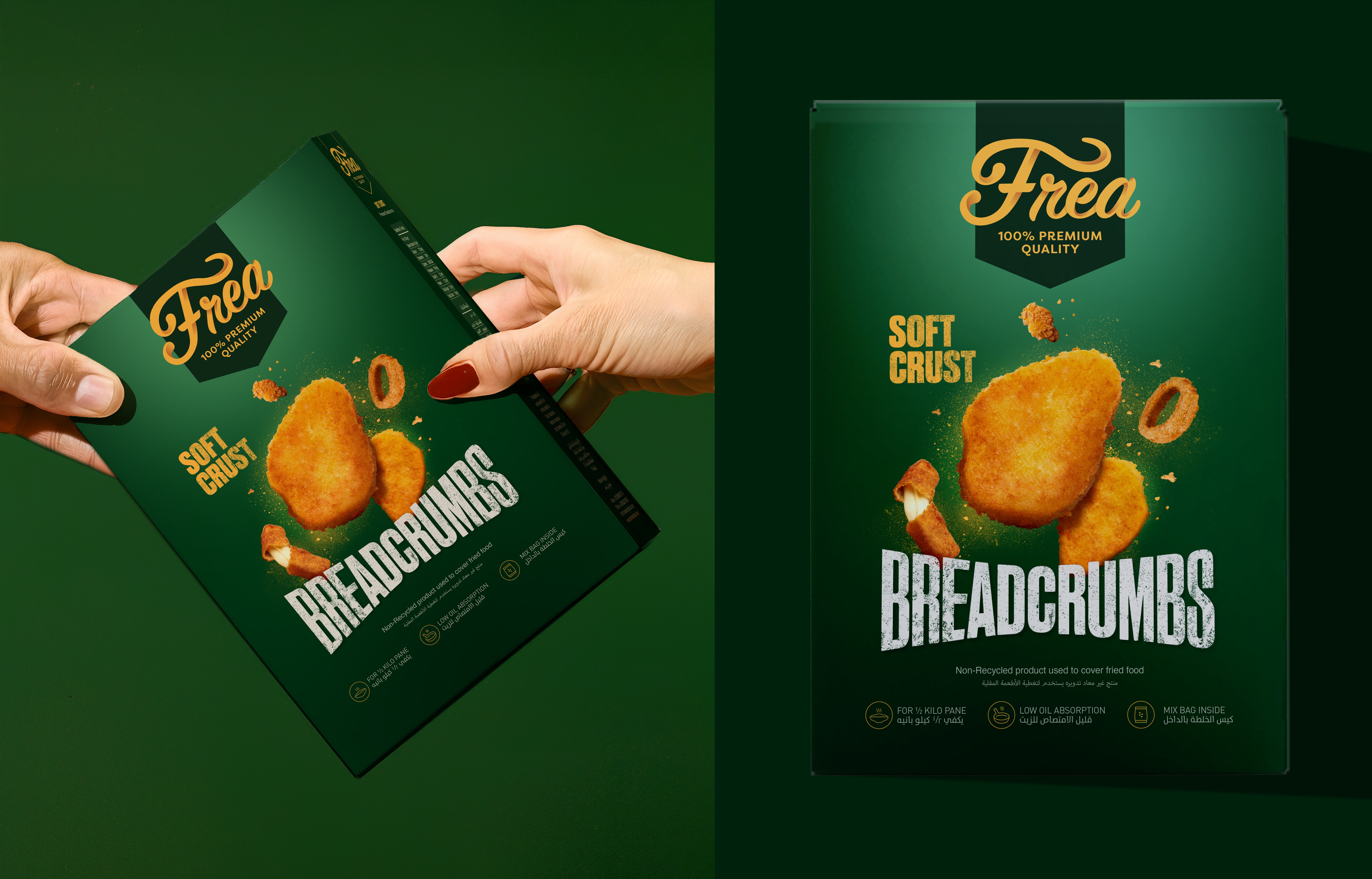
Client: Frea Breadcrumbs
Scope: Packaging Design, Logo Design, Product Shot Retouching
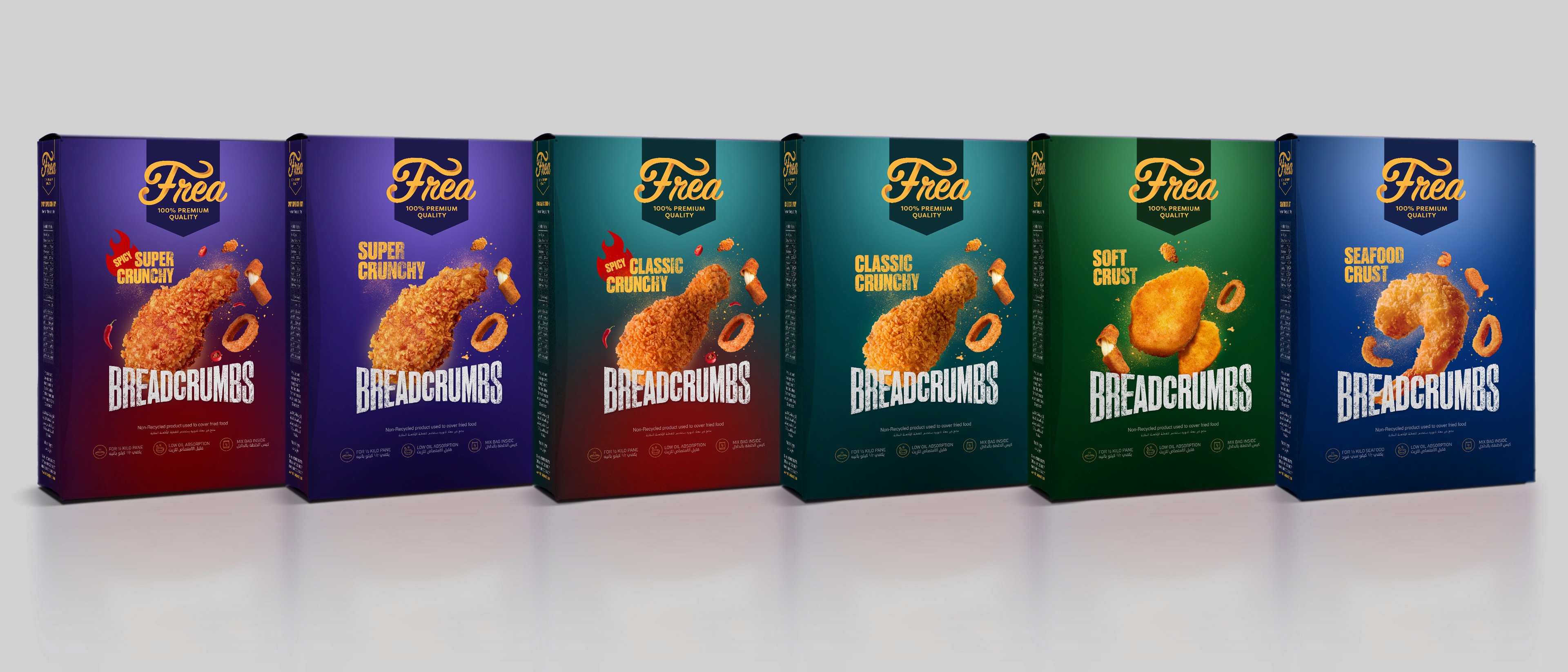
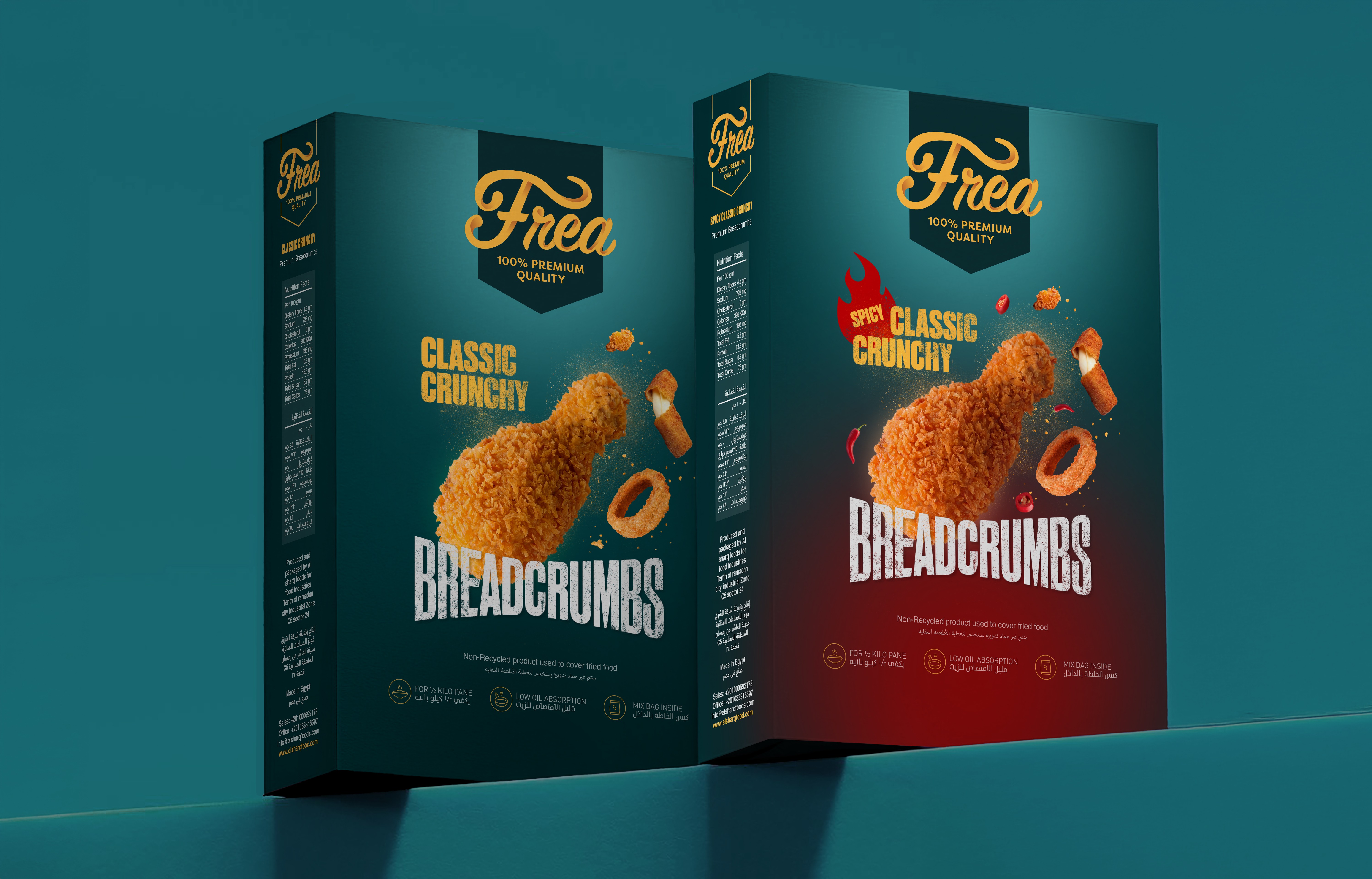
Breadcrumbs are not a glamorous product. They sit quietly on a shelf, functional, overlooked, and almost impossible to differentiate. Frea changed that. The challenge was not just designing a brand. It was making six variations of the same product feel distinct from one another while building a range that commands attention as a whole. Every SKU had to earn its place on shelf without losing sight of the system it belonged to.
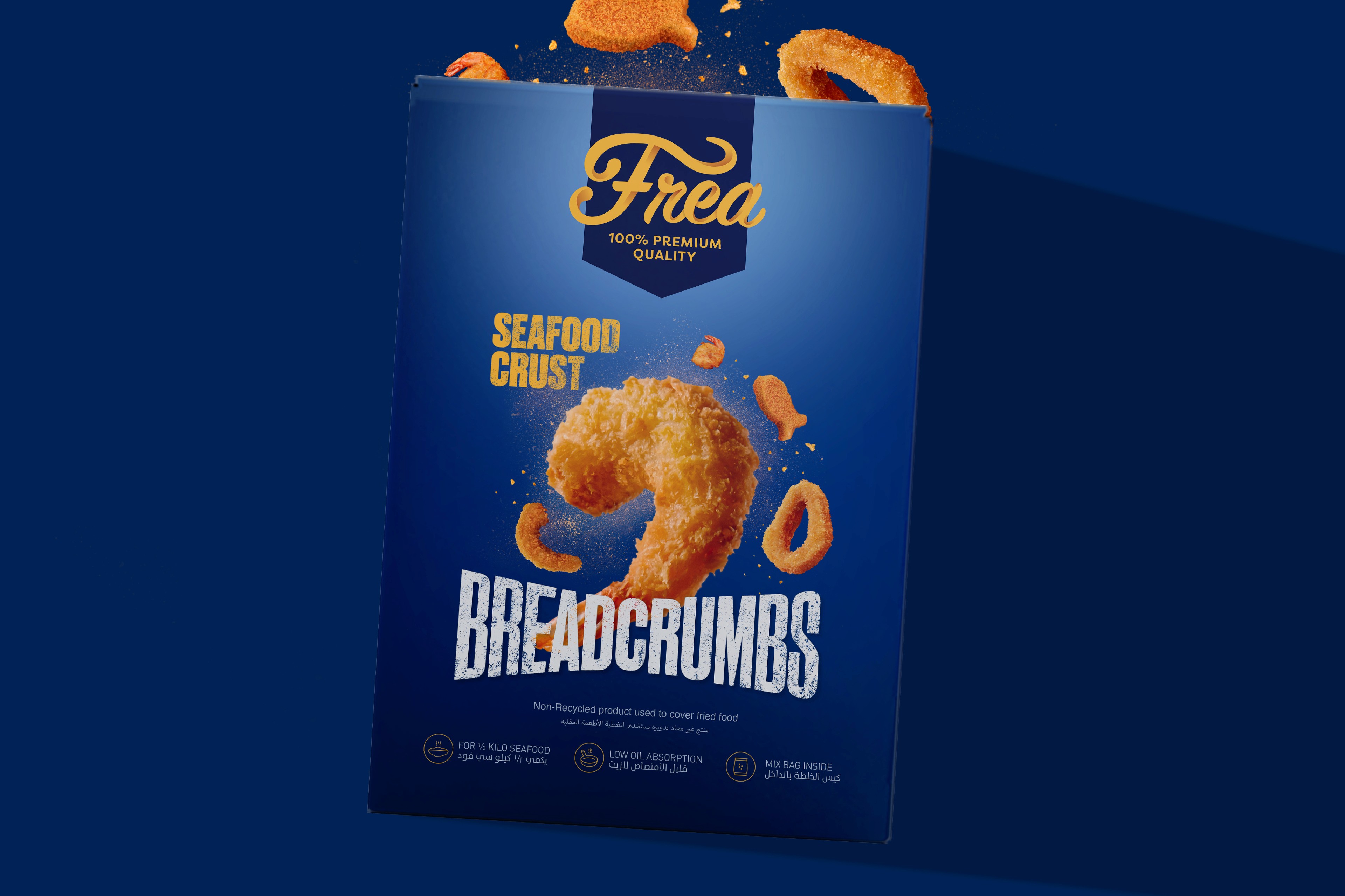
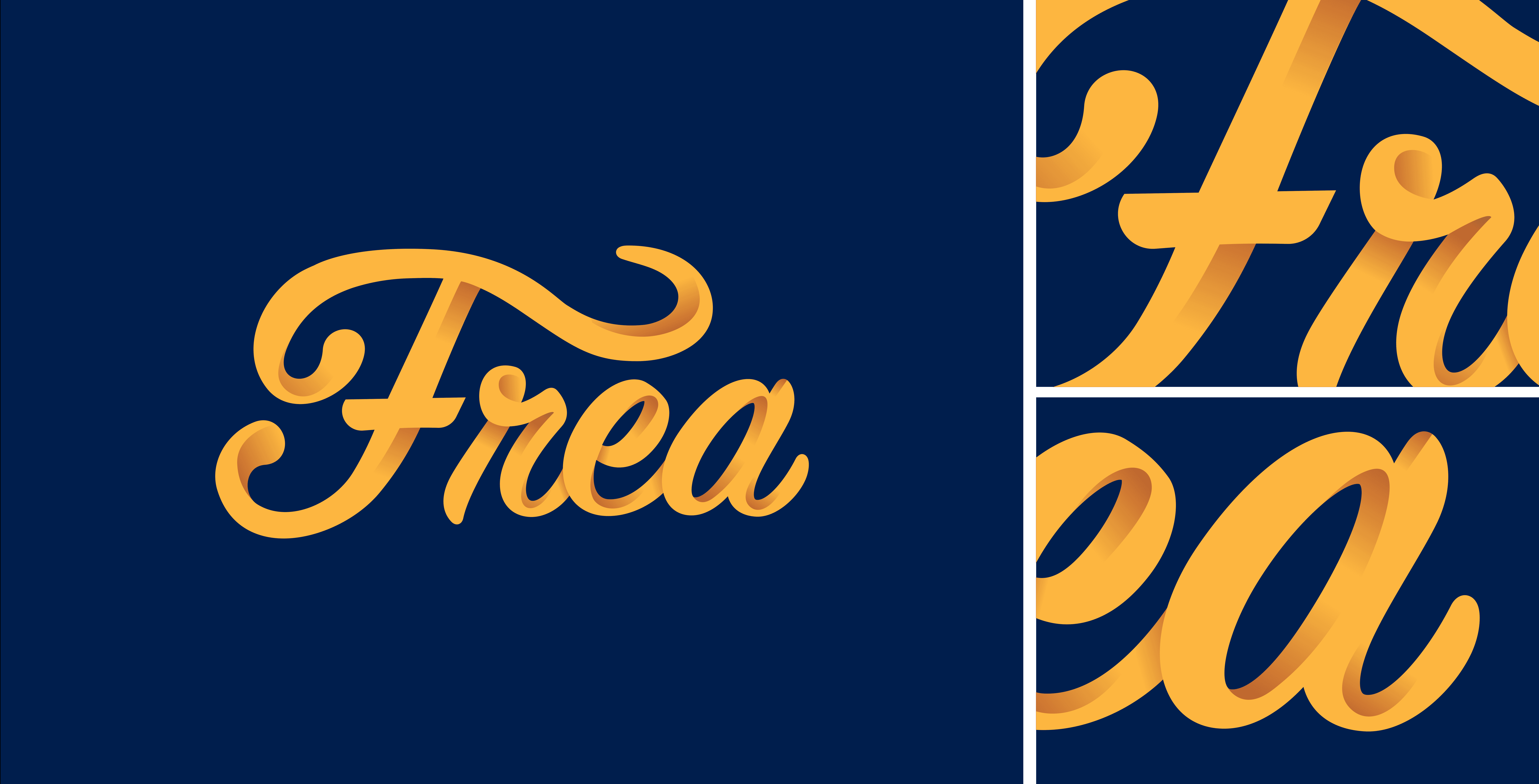
The Frea wordmark was crafted as a custom lettering piece in both English and Arabic. The English mark is a flowing script with generous curves and elegant weight contrast, warm and approachable without being generic. The Arabic version mirrors that energy in its own language, rounded and confident with the same three-dimensional depth treatment applied to both.

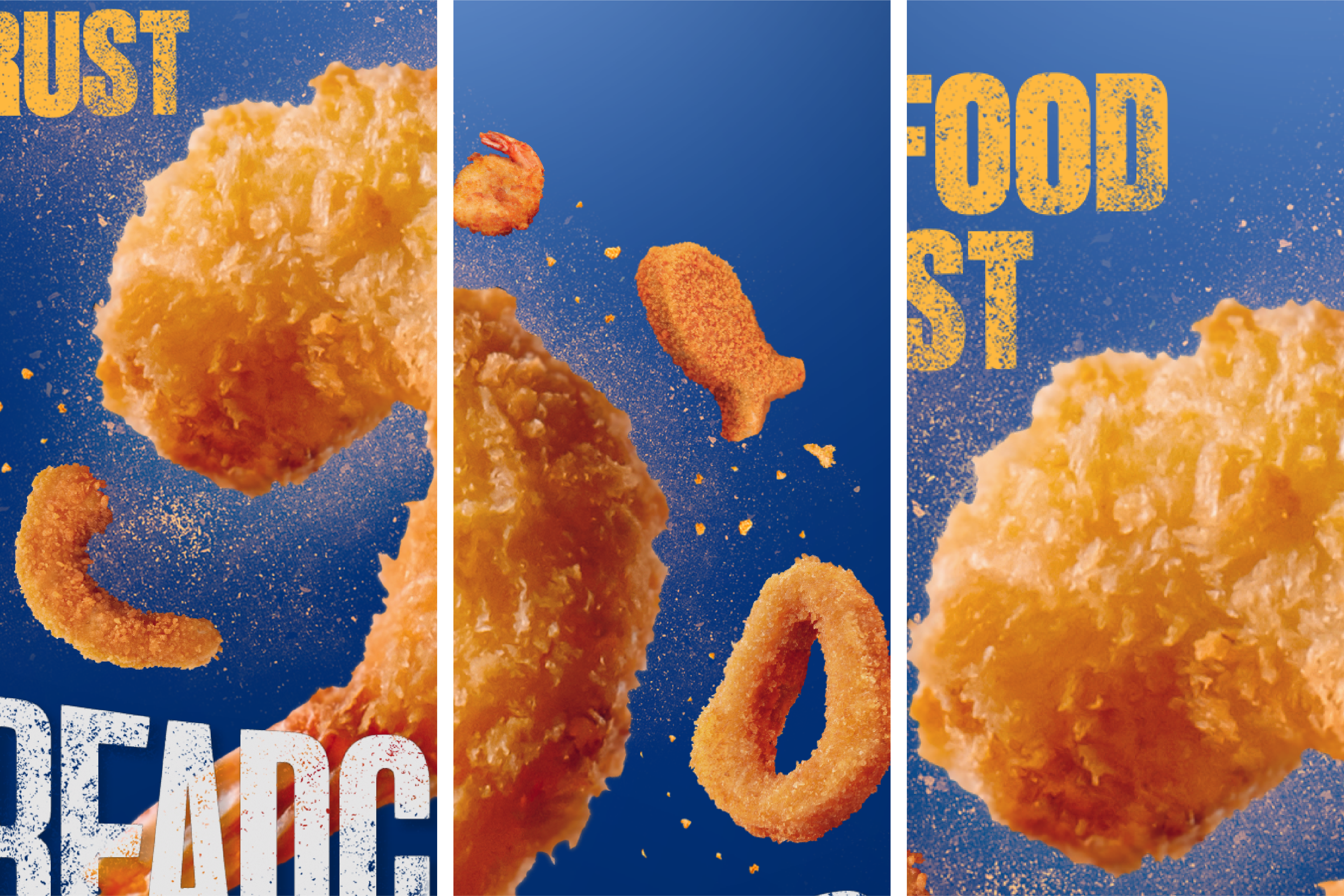
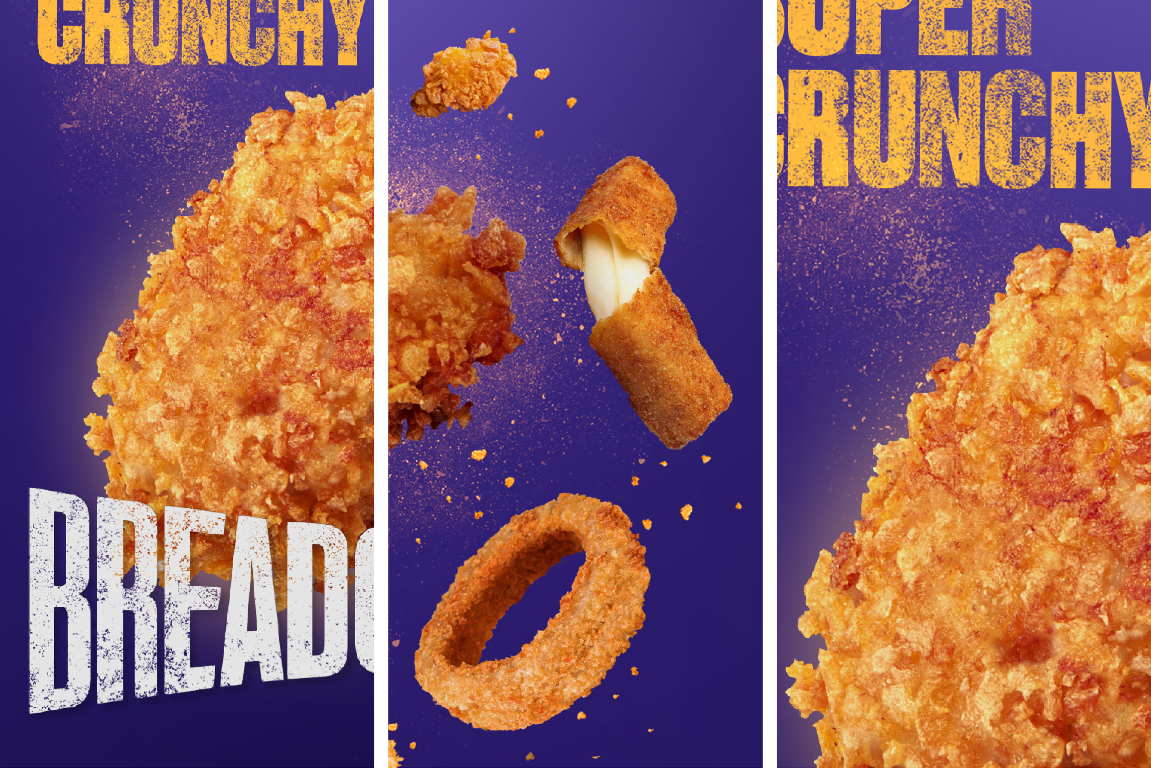
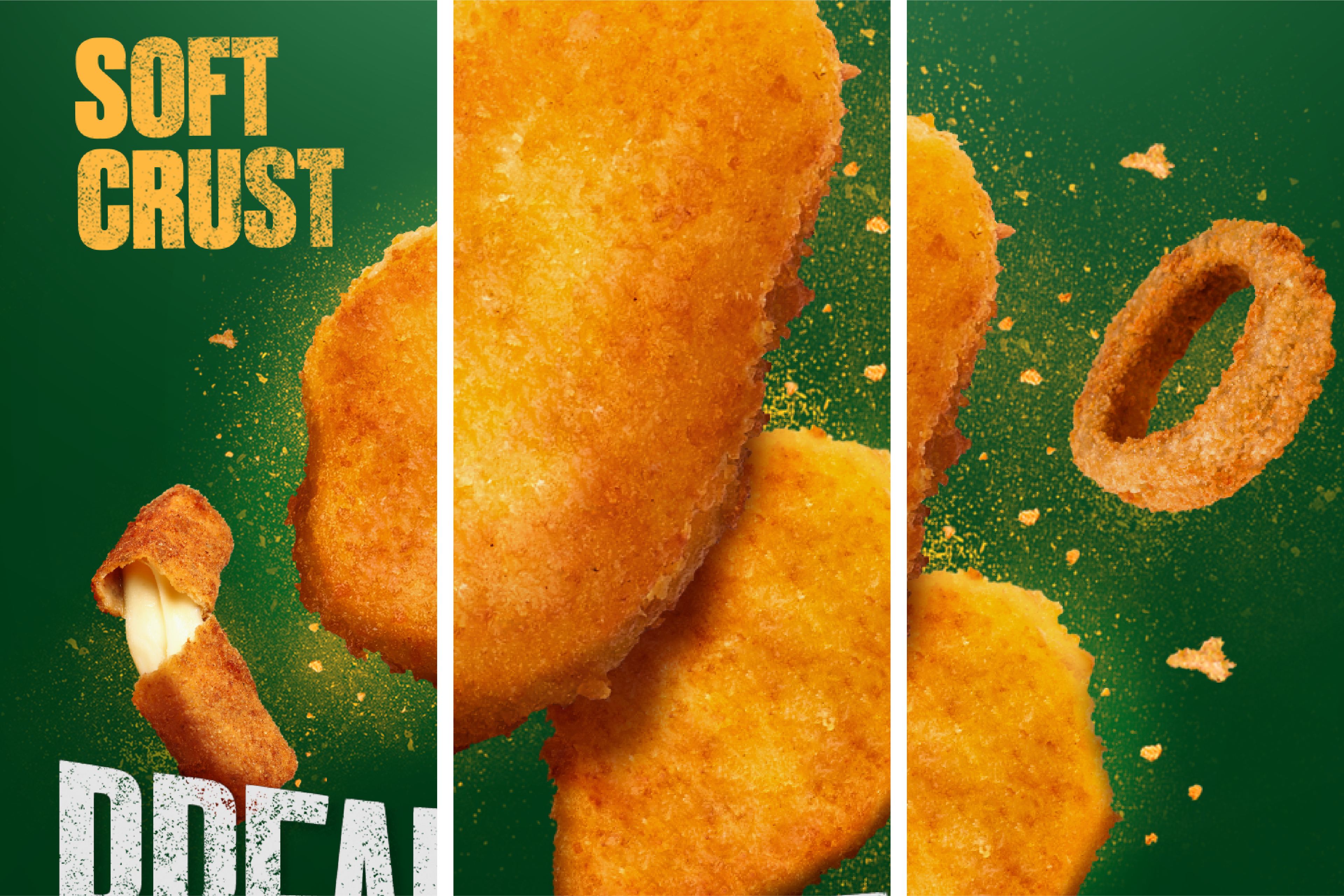
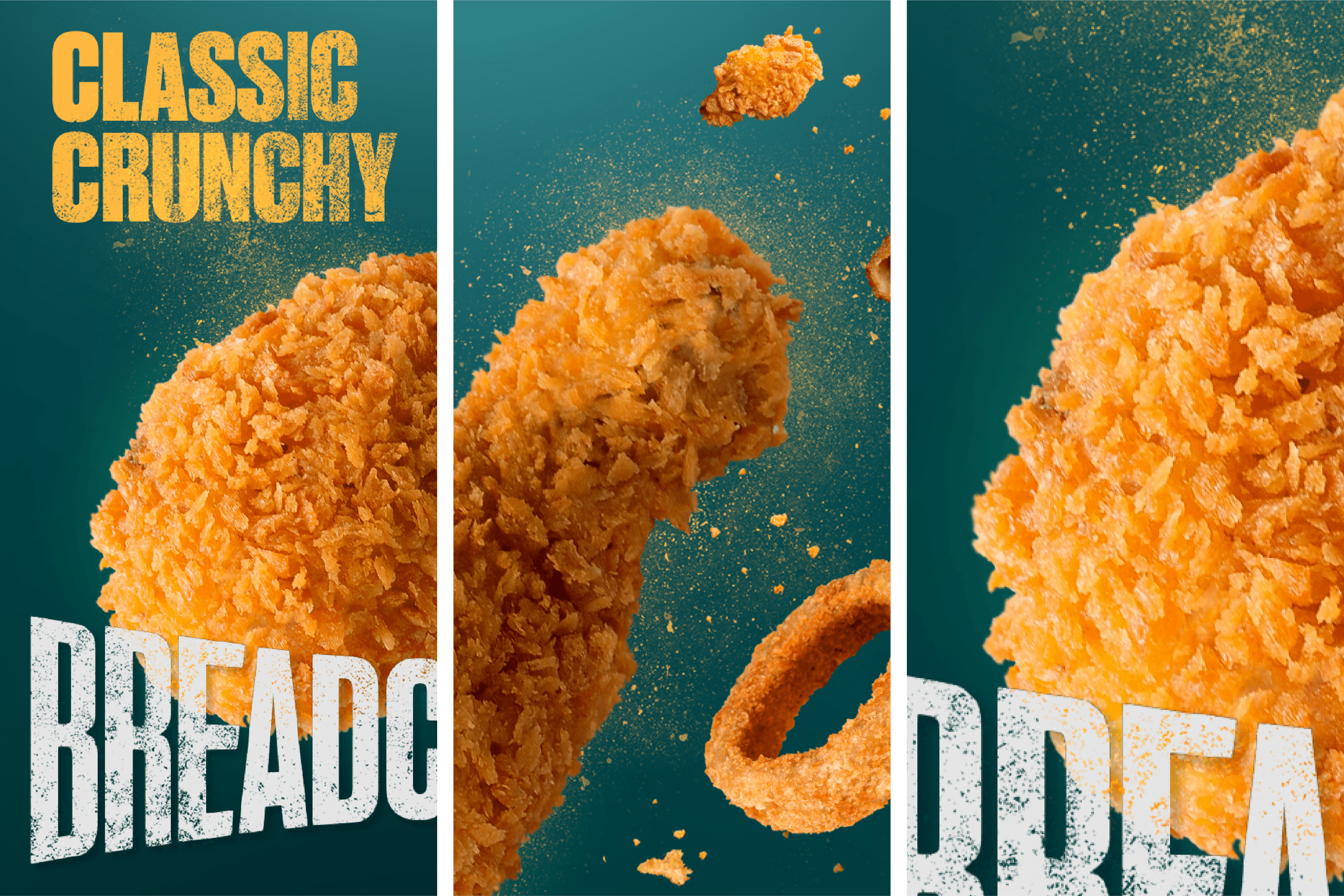
Six variants. Super Crunchy, Spicy Super Crunchy, Seafood Crust, Soft Crust, Classic Crunchy, Spicy Classic Crunchy. Each one has its own colour world, its own product hero shot, and its own typographic energy. Together they read as a family. Apart, each one stands on its own.