Brand Identity

Client: Saudi Football Federation
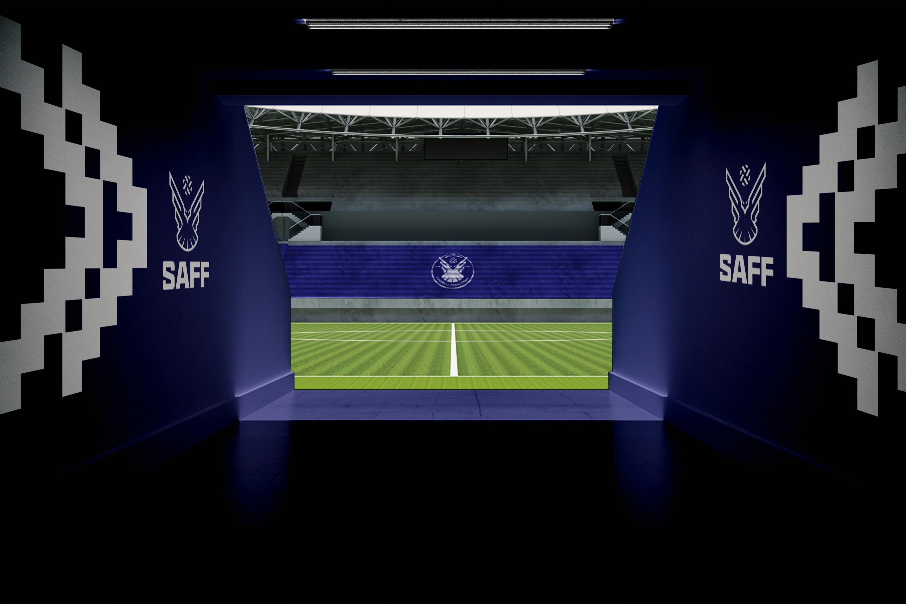
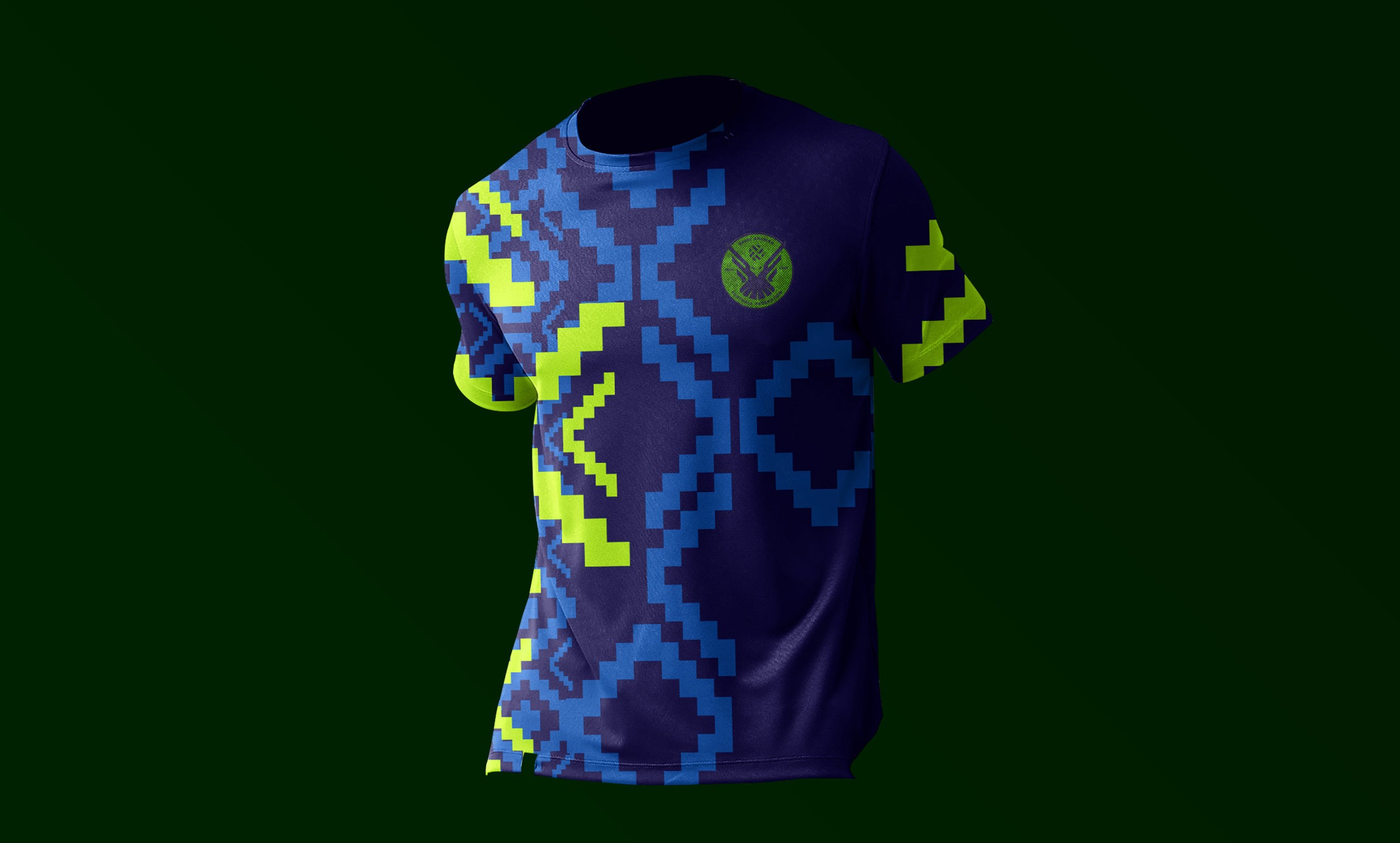
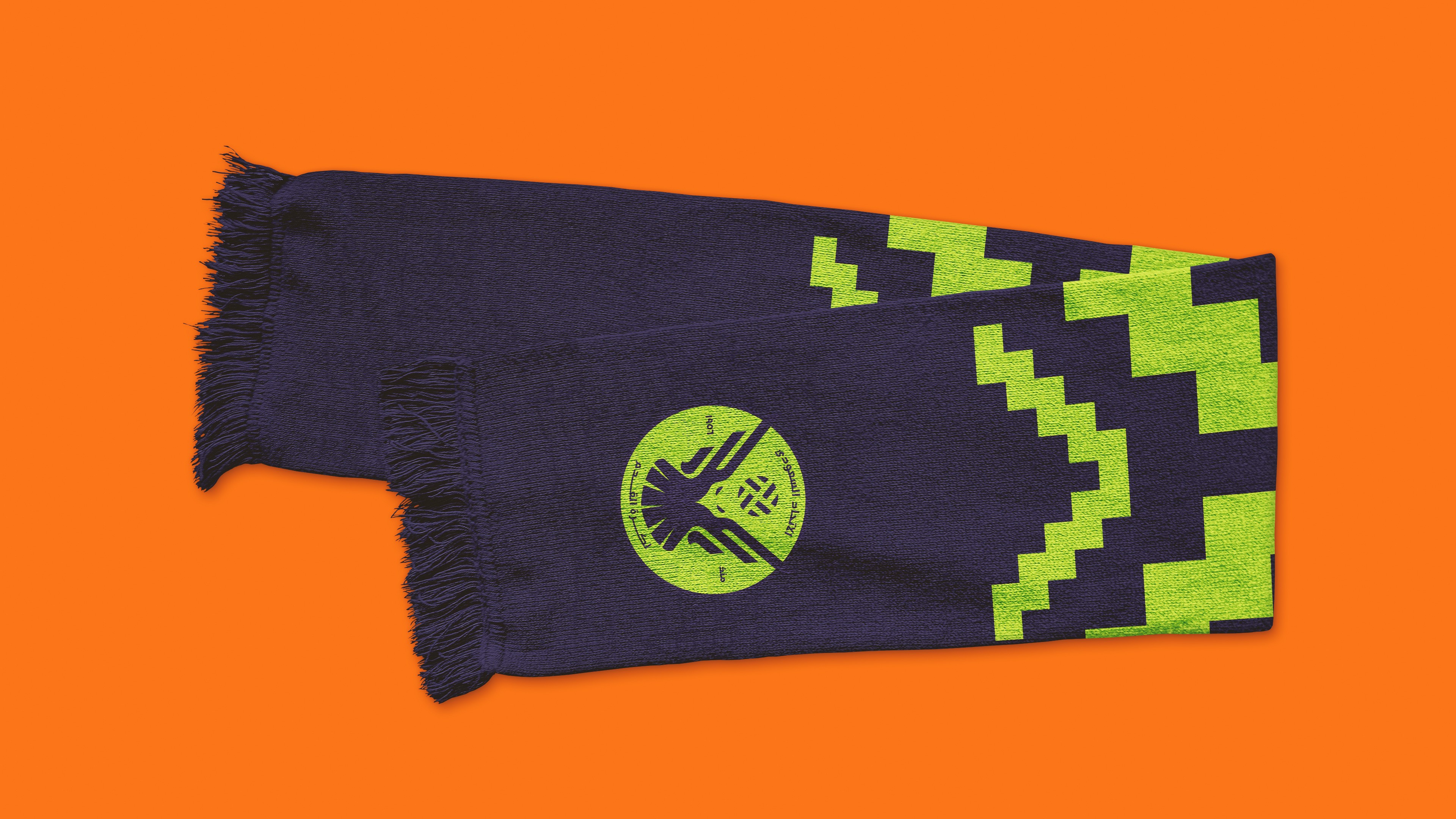
Scope: Brand Identity System, Colour Architecture, Pattern System, Typography, Mascot, & Environmental Applications.
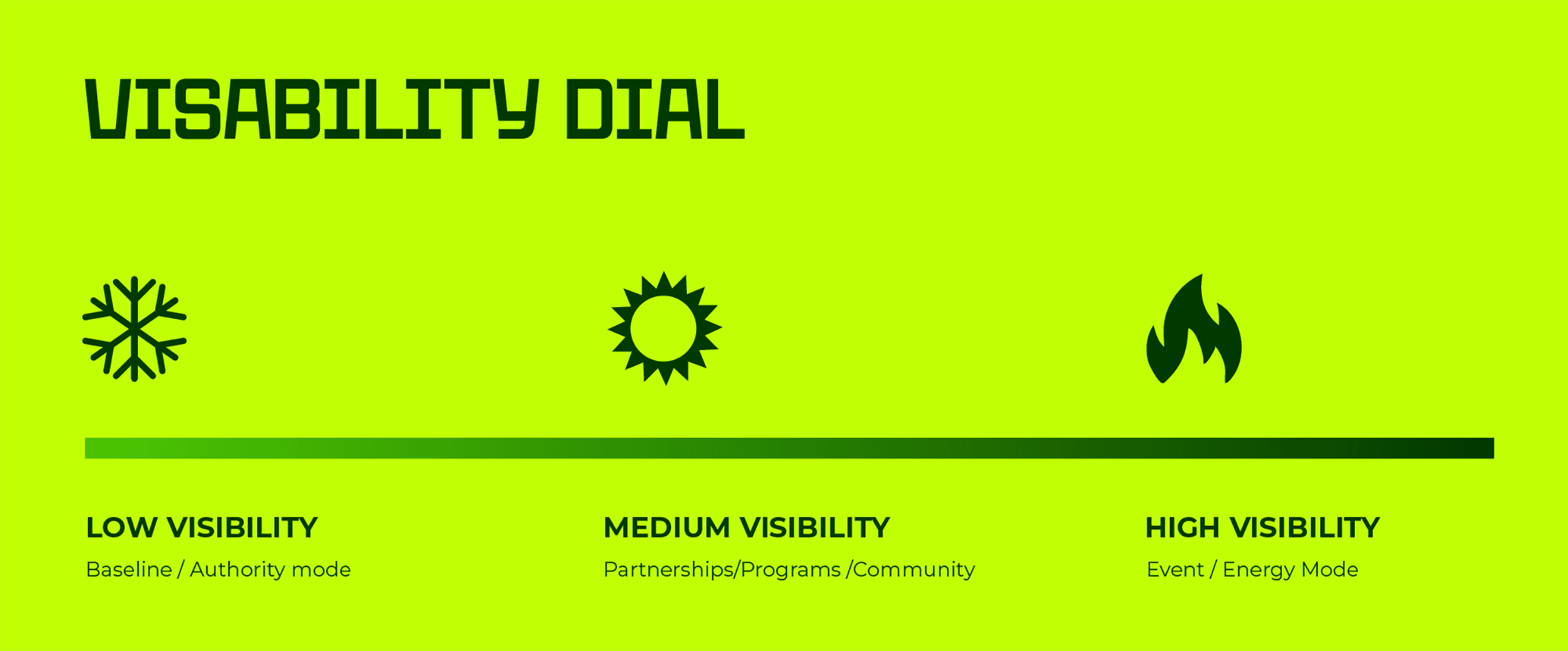
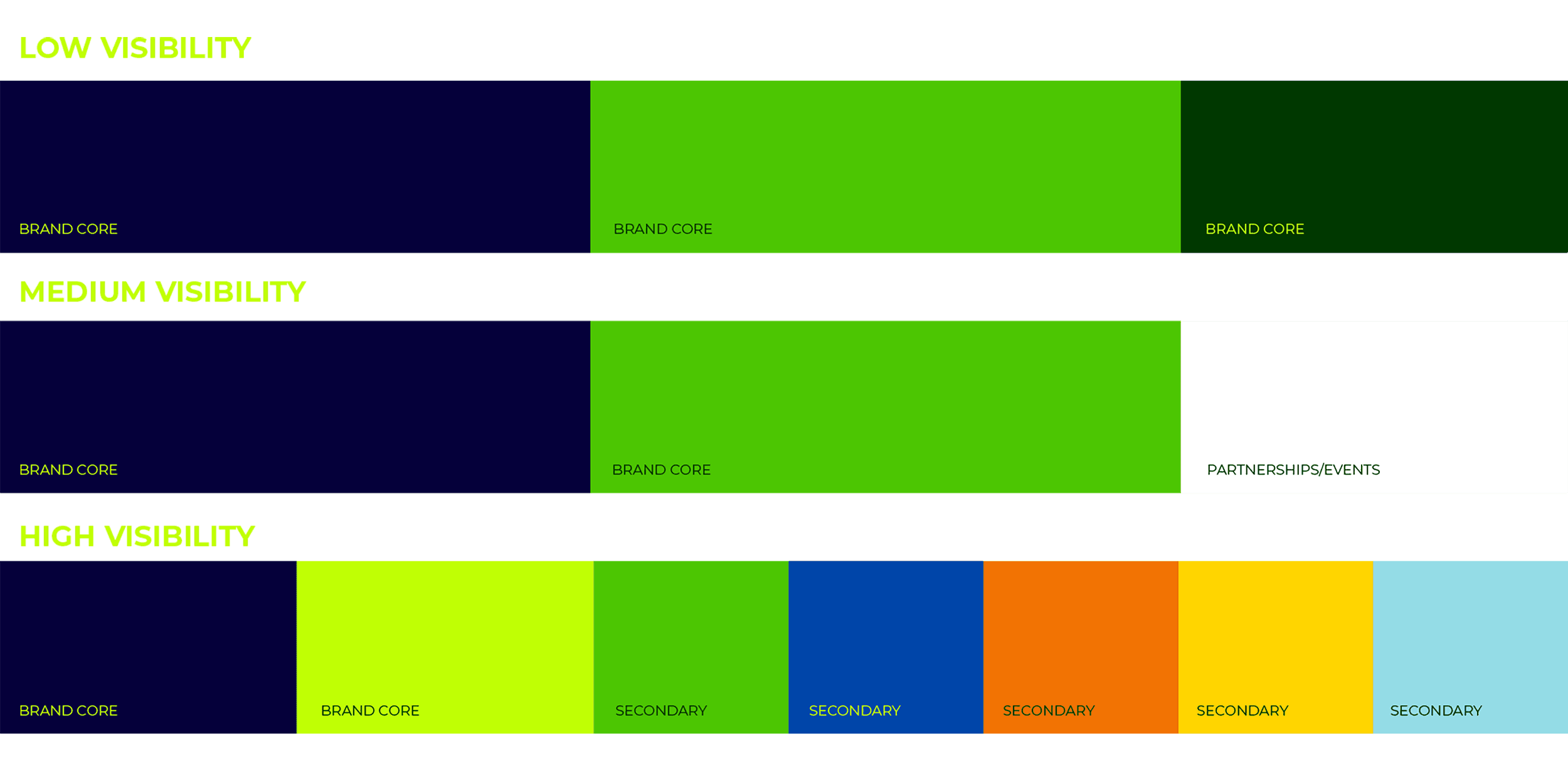
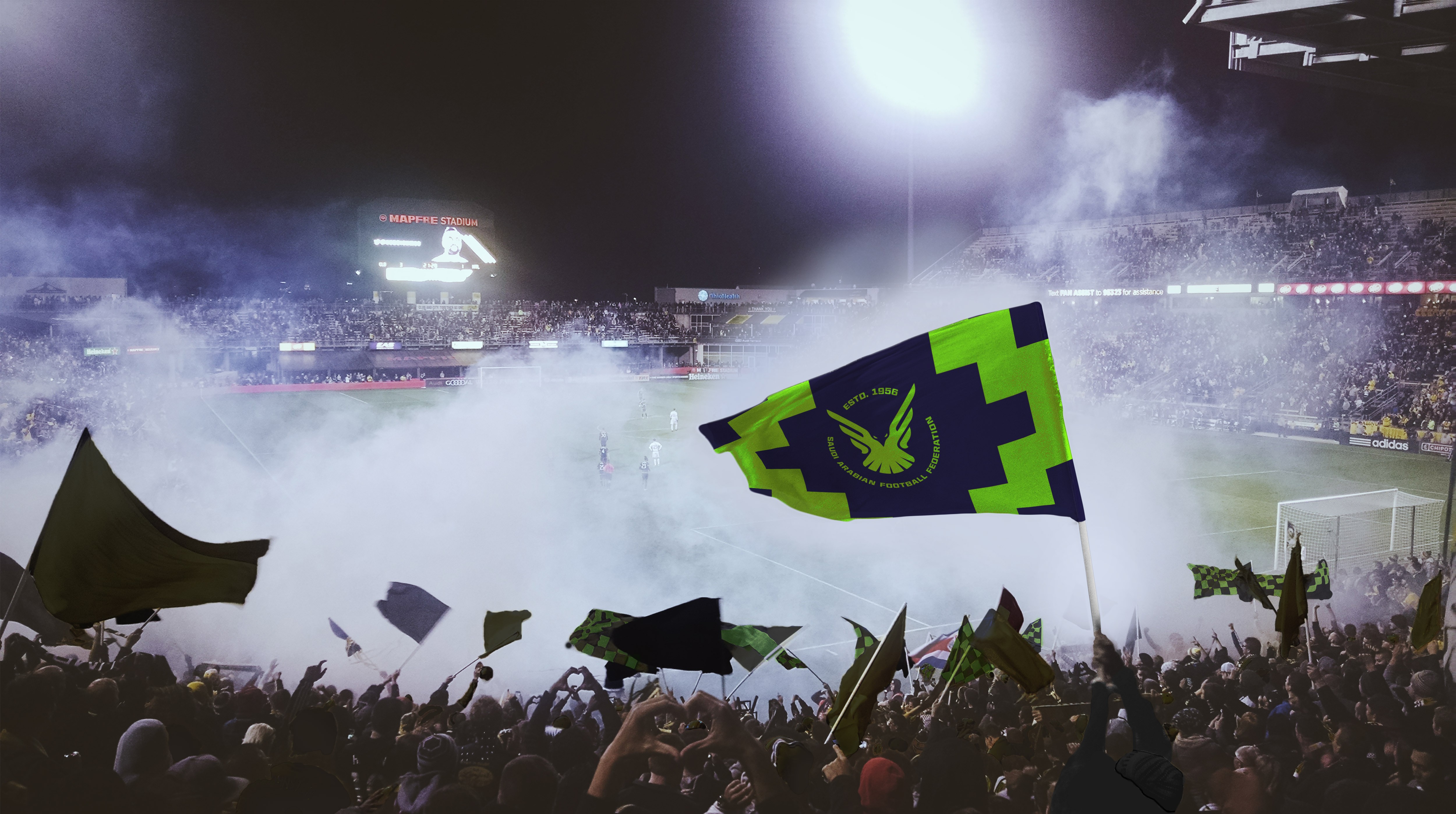
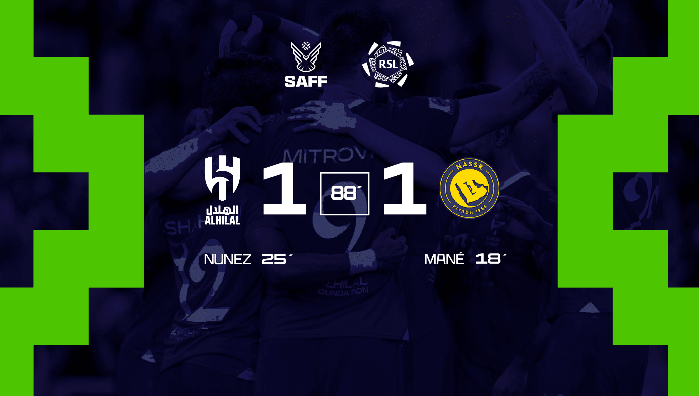
Saudi football is moving fast. SAFF needed a brand that could keep up. Credible enough for federation business, electric enough for a sold-out stadium, and systematic enough to hold together across everything in between.
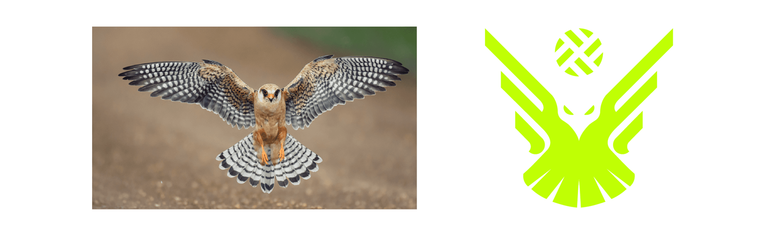
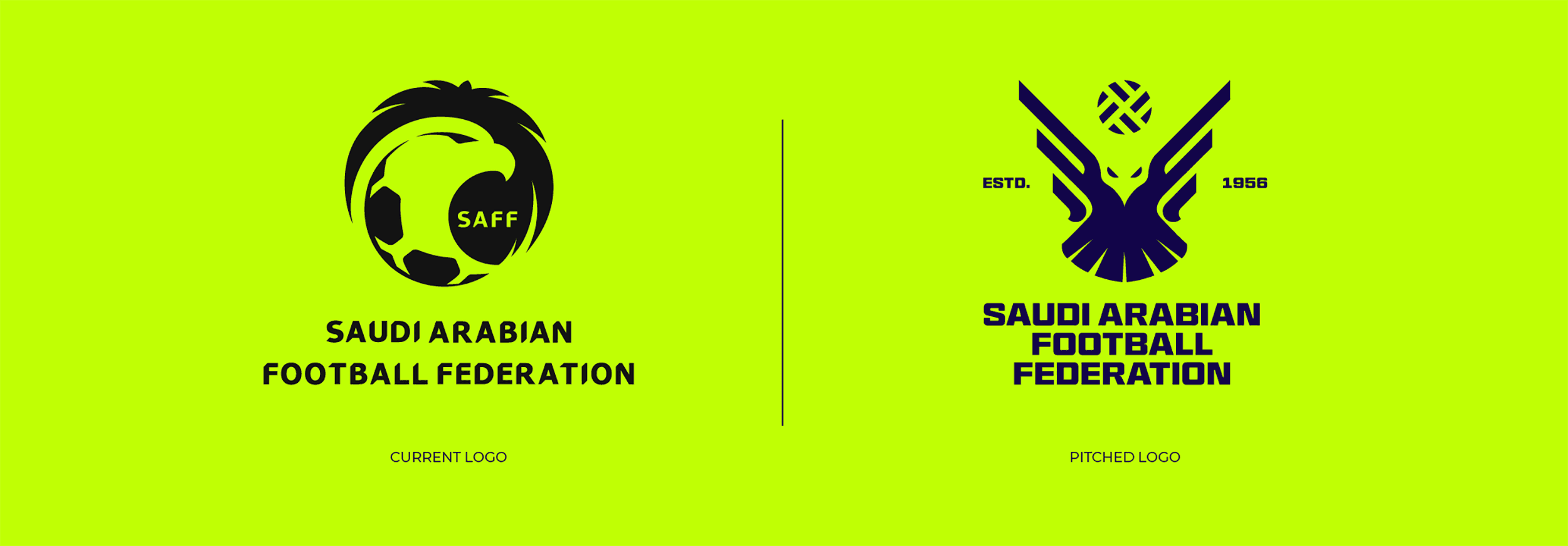
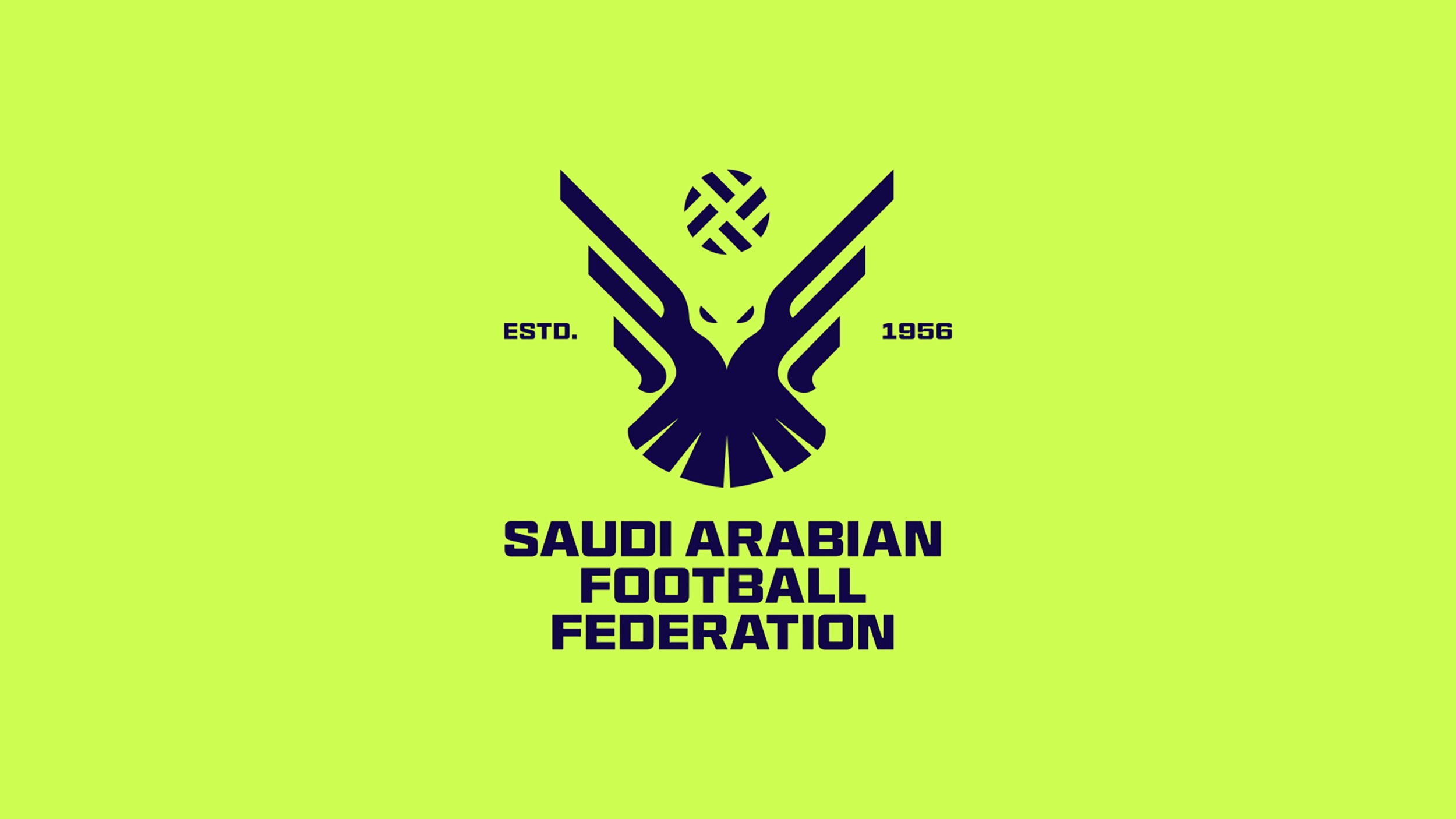
The existing SAFF identity had the right idea. The falcon was always there. But the execution was heavy, over-rendered, and stuck in a visual era that no longer reflects where Saudi football is heading. The rebrand strips it back. The falcon is now a flat, geometric mark. Wings spread in full flight, a football rising above. Sharp, bilateral, confident. Est. 1956 sits within the badge, keeping the heritage without leaning on it.
The falcon character is the brand at its most expressive. Athletic, focused, built for fan-facing content and high-visibility applications. Three poses, each designed for a specific context. Bold enough for a stadium screen, nimble enough for a social post.
© This project was developed under the creative direction of No One Design. All brand assets, trademarks, and intellectual property remain the property of their respective owners.